PCPartPicker data
Last updated January 1, 2017
In the summer of 2016 I built two high-end computers, something I haven't done since 2011. I used PCPartPicker to research the components and read about PC builds similar to the ones I had in mind. It's a relatively new site that has a strong community of builders, helpful tools to help with part compatibility as well as extensive user reviews on PC components.
Pouring over pages and pages of computer builds, CPUs, video cards and motherboards got me very interested in visualizing the data on both individual components and builds, and the relationship between component specifications and prices. This post will detail the process by which I collected, cleaned, visualized and analyzed all of the data on PCPartPicker.com. I've also done some work with natural language process (NLP) to do sentiment analysis on the collection of written user reviews for individual PC parts. If you read to the end you will get to see the two computers I built last summer: Ascension I (my personal machine) and Beast Mode II (BM2) (for my cousin).
Data Collection & Cleaning
For the most part, the data I wanted to collect was well organized and conveniently structured. Since the content on almost all of the pages on PCPartPicker is loaded dynamically, I decided to use a JavaScript engine called PhantomJS to retrieve the HTML after the page loaded. Scraping data would otherwise return only a skeleton of the DOM with no data. Here is the JavaScript file that I used with PhantomJS to scrape data:
'use strict'
var system = require('system')
var args = system.args
var page = require('webpage').create()

page.onConsoleMessage = function (msg) {
  console.log(msg)
}
var url = args[1]
page.open(url, function (status) {
  if (status === 'success') {
    page.evaluate(function () {
      console.log(document.body.innerHTML)
    })
  } else {
    console.log('not success')
  }
  phantom.exit(1)
})
PhantomJS was pretty painful to use, and I've heard of better options for web browser automation and web scrapping like Selenium, so I would probably use that for future projects. PhantomJS works fairly well, and this script, combined with the bash scripts below should be able to serve as a decent template for any similar type of web scraping project.
The first step is to loop through pages containing links of pages for both completed computer builds and computer parts using bash. Here's the bash script I used to scrape links to computer builds:
#!/use/bin/env bash
for i in `seq 1 1125`;
do
    phantomjs production.js "https://pcpartpicker.com/builds/#page="$i > pages/pages_$i.txt
    result=$(python -c "import random;print(random.uniform(2.1, 3.4))")
    sleep $result
done
The result of phantomjs saves HTML for a given page in the loop to a text file, and then waits for a few seconds before scraping the next page.
I then looped through these pages and pulled out all of the target links for PC builds and PC parts into separate text files using Beautiful Soup. Here's the script for that in python:
import os
import pandas as pd
from bs4 import BeautifulSoup

os.chdir('pages')
all_links = []
for i in os.listdir(os.getcwd()):
    text = open(i, "r")
    html = text.read()
    b = BeautifulSoup(html)
    links = b.findAll('a', attrs={"class":"build-link"})
    for a in links:
        path = a['href']
        all_links.append(path)
    b.decompose()
    text.close()

os.chdir('../')
url_file = open('links.txt', 'a')

for x in all_links:
    url_file.write('%s\n' % x)
url_file.close()
The first loop goes through all of the pages scraped with PhantomJS and puts each build-link in a list called all_links. The second loop writes each link to a new line in links.txt:
/b/4x4D4D
/b/ZhVnTW
/b/8fNG3C
/b/7KWZxr
/b/Qm6hP6
/b/X4rH99
...
The next step is one more bash script that scrapes HTML from individual builds and saves it to individual text files.
#!/use/bin/env bash

counter=1
while read NAME; do
    echo "[STATUS] Scraping build number $counter: $NAME..."
    file="new_build-"${NAME//\/b\//$counter-}
    phantomjs scrape_build.js "https://pcpartpicker.com$NAME" > builds/$file.txt
    result=$(python -c "import random;print(random.uniform(2.5, 4.4))")
    echo "[STATUS] Completed scraping build number $counter ($NAME). Sleeping for $result seconds..."
    sleep $result
    ((counter += 1))
done < links.txt
The script takes lines from links.txt and appends them to the base URL, scrapes the HTML from the resulting link and saves it to a text file.
The next step is to go through the text files for each PC build and create a pandas DataFrame containing data for each PC build (~25,000 builds total). Here's a sample PC build link: https://pcpartpicker.com/b/VD3bt6. This heavily commented script shows step-by-step how to scrape all of the relevant data from the HTML for PC builds:
import os
import pandas as pd
from bs4 import BeautifulSoup

os.chdir('builds/builds_html')
build_dict_list = []

files = os.listdir(os.getcwd())

for i in files:

    try:
        a = open(i, "r")
        b = BeautifulSoup(a)

        #Labels: Each build list has labels, for example: Video Card: GeForce GTX 1080
        labels = b.find('ul', attrs={"class":"parts"}).findAll('p', attrs={"label"})

        #The number of labels varies between builds
        #Some builds have multiple parts of the same type
        cols = [label.contents[0] for label in labels]

        #This will keep track of how many of each part there are
        count = [0 for x in range(len(cols))]

        #This handles multiple parts of the same type (e.g. 2 or more graphics cards)
        for x in range(len(cols)):
            count[x] = 1 + cols[0:x].count(cols[x])

        #Rename the labels with the corresponding count appended to the end
        new_cols = [str(x)+"_"+str(y) for (x,y) in zip(cols, count)]

        #Values (Names of parts)
        values = b.find('ul', attrs={"class":"parts"}).findAll('a', attrs={"name"})
        vals = [value.contents[0] for value in values]

        #Links
        link_list = b.find('ul', attrs={"class":"parts"}).findAll('a', attrs={"name"})
        link_list = [link['href'] for link in link_list]

        #Prices: there is a an individual price for each part and a total price for the build
        prices = b.find('ul', attrs={"class":"parts"}).findAll('div', attrs={"price"})
        price_list = [price.contents[0].strip() for price in prices]

        #This creates a dictionary for each component of the build
        #Contains the component name, link and price (the price reported by the user)
        build_part_dict = {part: {"Link":link,"Price":price,"Name":name} for part, link, price, name in zip(new_cols, link_list, price_list,vals)}

        #Total price
        total_price = float(b.find("li",attrs={"class":"partlist-total"}).find('span', attrs={"class":"price"}).contents[0].strip("$"))
        total_price_dict = {"total":total_price}

        #Description
        description_paragraphs = b.find('div', attrs={'class':'description block'}).find_all('p')
        description_clean = ''
        for paragraph in description_paragraphs:
            add = paragraph.text
            description_clean += add + ' '
        description_dict = {'Description':description_clean}

        #Builder
        build_name = b.find('h1', attrs={"class":"name"}).contents[0]
        builder_link = b.find('p', attrs={"class":"owner"}).find('a')['href']
        builder_dict = {"Builder":build_name}
        owner_dict = {"Owner":builder_link}

        #Details: Details include clock speed, temperatures, date built, etc.
        #The process is similar to sraping the components, but there is no need to worry about duplicate parts
        detail_vals = [x.strip(u" ").strip(u'\n').strip() for x in b.find('div', attrs={"class":"part-details"}) if "\n " in x]
        details = [x.contents[0] for x in b.find('div', attrs={"class":"part-details"}).find_all('h4')]
        detail_dict = {detail:detail_val for detail_val, detail in zip(detail_vals, details)}

        #Permalink
        perma_link = b.find('input', attrs={"type":"text"})['value'].split("/b/")[1]
        build_dict = {"Permalink": perma_link, "Builder":builder_link}

        #Join all of the above dictionaries into a master build dictionary
        master_dict = dict(build_dict.items()+builder_dict.items()+build_part_dict.items()+detail_dict.items()+total_price_dict.items()+owner_dict.items() + description_dict.items())

        #Add the dictionary to build_dict_list defined above
        build_dict_list.append(master_dict)

        #This is important for preventing memory leaks in bs4
        b.decompose()
        a.close()

    #Some builds have been deleted, even though the links are still listed, so we pass the build if there are any issues scraping data from it
    except:
        pass

#Create a pandas DataFrame from build_dict_list
df = pd.DataFrame(build_dict_list)
os.chdir('/Users/andrewcaffey/Documents/Projects/Data/PCPP/builds/')
#Save the DataFrame to a csv file
df.to_csv('builds.csv', encoding='utf-8')
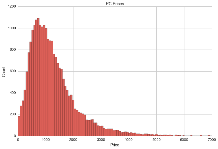
At this point we can do a quick visualization of the distribution of PC prices:
df.total[(df.total>0)&(df.total<7000)].hist(bins=100, figsize=(20,10))
The mean PC price is $1,292. However, the price of PCs is not reflected accurately in df.total. I noticed that some builds include multiple monitors while others don't include any and some builders don't include prices for components from their previous PC builds.
The data frame contains 141 columns for parts. Here they are:
All-In-One Monitor/Chassis_1 CPU Cooler_1 CPU Cooler_2 CPU Cooler_3 CPU_1 CPU_2 Case Accessory_1 Case Accessory_2 Case Fan_1 Case Fan_10 Case Fan_11 Case Fan_12 Case Fan_13 Case Fan_14 Case Fan_15 Case Fan_16 Case Fan_17 Case Fan_18 Case Fan_19 Case Fan_2 Case Fan_20 Case Fan_21 Case Fan_22 Case Fan_23 Case Fan_24 Case Fan_25 Case Fan_26 Case Fan_27 Case Fan_28 Case Fan_29 Case Fan_3 Case Fan_30 Case Fan_31 Case Fan_32 Case Fan_4 Case Fan_5 Case Fan_6 Case Fan_7 Case Fan_8 Case Fan_9 Case_1 Coolant_1 External Storage_1 External Storage_2 External Storage_3 External Storage_4 Fan Controller_1 Fan Controller_2 Food_1 Food_2 Food_3 Headphones_1 Headphones_2 Headphones_3 Headphones_4 Keyboard_1 Keyboard_2 Keyboard_3 Keyboard_4 Keyboard_5 Keyboard_6 Keyboard_7 Laptop_1 Memory_1 Memory_2 Memory_3 Memory_4 Memory_5 Memory_6 Memory_7 Memory_8 Monitor_1 Monitor_2 Monitor_3 Monitor_4 Monitor_5 Monitor_6 Motherboard_1 Mouse_1 Mouse_2 Mouse_3 Mouse_4 Mouse_5 Operating System_1 Optical Drive_1 Optical Drive_2 Optical Drive_3 Optical Drive_4 Power Supply_1 Radiator_1 Reservoir_1 Software_1 Software_2 Software_3 Software_4 Software_5 Software_6 Sound Card_1 Sound Card_2 Speakers_1 Speakers_2 Storage_1 Storage_10 Storage_11 Storage_12 Storage_13 Storage_14 Storage_15 Storage_16 Storage_17 Storage_18 Storage_19 Storage_2 Storage_20 Storage_21 Storage_22 Storage_23 Storage_24 Storage_25 Storage_3 Storage_4 Storage_5 Storage_6 Storage_7 Storage_8 Storage_9 Thermal Compound_1 Thermal Compound_2 Thermal Compound_3 Thermal Compound_4 UPS_1 Video Card Cooler_1 Video Card Cooler_2 Video Card_1 Video Card_2 Video Card_3 Video Card_4 Wired Network Adapter_1 Wired Network Adapter_2 Wireless Network Adapter_1 Wireless Network Adapter_2
That's right, somebody included mulitple food items in their PC build! One build listed 29 hard drive disks and another listed 32 case fans. So, it will make more sense to look at individual PC builds by their core components:
- case
- CPU
- GPU (multiple)
- motherboard
- memory (multiple)
- storage (multiple)
- CPU cooler
- PSU (power supply unit)
Most of the PC builds have at least one of these core components.
Part Data
Collecting data for individual parts followed the same process as collecting data for completed builds. Here are the counts of parts I collected by type:
| Case | - | CPU | - | CPU Coooler | - | Case Fan | - | GPU | - | Hard Drive | - | Memory | - | Monitor | - | Motherboard | - | PSU | - | UPS |
|---|---|---|---|---|---|---|---|---|---|---|---|---|---|---|---|---|---|---|---|---|
| 2774 | 886 | 730 | 1192 | 2996 | 1736 | 1700 | 600 | 2400 | 1434 | 300 |
Here's a quick look at the features I am interested in for each part:
- Case
- Color, Manufacturer, Name, Dimensions, Volume, Average Price, Type
- CPU
- Name, Manufacturer, Lithography, TDP, Operating Frequency, Boost Frequency, Core Count, Hyperthreading, Maximum Supported Memory, Average Price
- CPU Cooler
- Manufacturer, Maximum Noise Level, Maximum RPM, Liquid Cooled, Radiator Size, Bearing Type, Height
- Case Fan
- RPM
- GPU
- Memory (GB), NVIDIA/AMD, Clock Speed (MHz), Boost Clock Speed (MHz), Chipset, Manufacturer, TDP, Model
- Hard Drive
- Storage (GB), RPM, SSD/Spinning, Price/GB, Form Factor, Manufacturer
- Memory
- Manufacturer', CAS, Price/GB, DDR3/DDR4, Speed, DIMM, Size (GB), Module Count, Module Size, Voltage
- Monitor
- Refresh rate, Response Time (ms), Screen Size, Viewing Angle, Aspect Ratio, Brightness, Display Colors, Manufacturer, LED, Recommended Resolution, Wide Screen, Curved Screen
- Motherboard
- Socket, Maximum Supported Memory, Memory Slots, Chipset
- Power Supply Unit (PSU)
- Modular, Power, Price/Watt, Manufacturer, Efficiency Certification
- UPS
- Charge time
There's a lot of data for each part, some parts are missing a lot of price data. Each part has a list of vendors with prices that are in the same neighborhood. To impute missing prices on the builds DataFrame, I will be imputing the average price. For parts missing pricing data, where it makes sense, I'll be using a few different methods to predict the average price (linear regression, decision tree, random forest) and then use those predicted values to fill missing on the builds DataFrame.
Here's a link to one of the pages that I scraped with this script: https://pcpartpicker.com/product/MYH48d/corsair-memory-cmk16gx4m2b3000c15. I was able to use this script for each type of part thanks to the consitent stucture and DOM naming scheme.
import os
import pandas as pd
from bs4 import BeautifulSoup

#navigate to the directory containing HTML for PSUs
os.chdir("parts/PSU/parts/")
part_list = []
comments = []
for i in os.listdir(os.getcwd()):
    a = open(i, 'r')
    #print a.read()
    b = BeautifulSoup(a)

    average_rating = b.find('span', attrs={'itemprop': 'ratingValue'})
    ratings_count = b.find('span', attrs={'itemprop':'ratingCount'})
    if (average_rating != None) & (ratings_count != None):
        ratings_dict = {'average_rating':average_rating.text, 'ratings_count':ratings_count.text}

    #part name, kind and link
    if b.find('h4', attrs={'class':'kind'}) != None:
        kind = b.find('h4', attrs={'class':'kind'}).text
        part_name = b.find('h1', attrs={'class':'name'}).text
        link = b.find('input', attrs={'name':'url'})['value']
        info_dict = {'Kind':kind, 'Name':part_name, 'Link': link}

        #prices
        if b.find_all('td', attrs={'class':'base'}) != None:
            price_list = b.find_all('td', attrs={'class':'base'})
            price_list = [float(x.text.strip('$')) for x in price_list]
            #average_price = sum(price_list)/len(price_list)
            price_dict = {'Prices':price_list,}

        #specs
        spec_labels = b.find('div', attrs={'class':'specs block'}).find_all('h4')
        spec_labels = [x.contents[0] for x in spec_labels]
        spec_values = str(b.find('div', attrs={'class':'specs block'}))

        #this part was a little tricky since the values were placed outside of HTML tags
        #thankfully I managed to figure out a pattern that would extract everything neatly
        vals = [x.strip().split('</h4>')[1].strip('\n').strip() for x in spec_values.split("<h4>")[1:]]
        vals[-1] = vals[-1].split('\n')[0]
        spec_values = vals

        spec_values = spec_values[0:len(spec_labels)+1]
        spec_dict = {spec_label:spec_value for spec_label, spec_value in zip(spec_labels,spec_values)}

        part_dict = dict(spec_dict.items() + info_dict.items() + price_dict.items() + ratings_dict.items())
        part_list.append(part_dict)

    #ratings
    if (average_rating != None) & (ratings_count != None):
        ratings_dict = {'average_rating':average_rating, 'ratings_count':ratings_count}
    reviews = b.find('div', attrs={'class':'part-reviews'})
    if reviews != None:
        reviews = reviews.find_all('div',attrs={'class':'part-review-block'})
        star_list = [len(reviews[x].find('ul',attrs={'class':'stars'}).find_all('li',attrs={'class':'full-star'})) for x in range(len(reviews))]

        comment_text_list = b.find_all('div', attrs={'class':'comment-message markdown'})
        comment_text_list = [comment_text_list[x].find_all('p') for x in range(len(comment_text_list))]

        comment_text_list_clean = []
        for i, x in enumerate(comment_text_list):
            comment = ""
            for y in x:
                try:
                    comment += y.contents[0] + " "
                except:
                    pass
            comment_text_list_clean.append(comment)

        review = zip(star_list, comment_text_list_clean)
        comments.append(review)

    a.close()
    b.decompose()

df = pd.DataFrame(part_list)
Power Supply Unit (PSU)
Each type of part required a bit of formatting, especially things measured in MHz/GHz and MB/GB, and specs with lots of missing values. Here's a little bit of the cleaning I did for power supply units (PSUs).
#strip the word Watts from the Wattage specs
df['power'] = [float(x.strip('Watts')) if x != '' else 0 for x in df.Wattage]
#price per watt
df['ppw'] = [x/y for x,y in zip(df.avg, df.power)]
#dictionary to translate efficiency ratings from text to integers
eff_rank_mapping = {u'80+ Bronze':2, u'80+ Gold':4, u'80+':1, u'80+ Titanium':6, u'80+ Platinum':5, u'-':0, u'80+ Silver':3}
#map efficiency ratings to integers
df['eff_rank'] = df['Efficiency Certification'].map(eff_rank_mapping)
Let's take a look at some of the data we have so far:
plt.figure(figsize=(12,8))
plt.axis([0,1800,0,500])
plt.title('PSU Wattages vs. PSU Prices', fontsize=16)
plt.xlabel('Wattage', fontsize=14)
plt.ylabel('Price', fontsize=14)
#colors = ['black', 'bronze', 'silver', 'gold', 'green', 'red']
colors = ['#000000', '#cd7f32', '#CCCCCC', '#ffd700', '#00ff00', '#ff0000']

ef1 = plt.scatter(df[df.eff_rank==1].power, df[df.eff_rank==1].avg, color = colors[0], s=50)
ef2 = plt.scatter(df[df.eff_rank==2].power, df[df.eff_rank==2].avg, color = colors[1], s=50)
ef3 = plt.scatter(df[df.eff_rank==3].power, df[df.eff_rank==3].avg, color = colors[2], s=50)
ef4 = plt.scatter(df[df.eff_rank==4].power, df[df.eff_rank==4].avg, color = colors[3], s=50)
ef5 = plt.scatter(df[df.eff_rank==5].power, df[df.eff_rank==5].avg, color = colors[4], s=50)
ef6 = plt.scatter(df[df.eff_rank==6].power, df[df.eff_rank==6].avg, color = colors[5], s=50)

plt.legend((ef1, ef2, ef3, ef4, ef5, ef6),
           ('80+', '80+ Bronze', '80+ Silver', '80+ Gold', '80+ Platinum', '80+ Titanium'),
           title = 'Efficiency Rating',
           scatterpoints=3,
           loc='upper left',
           ncol=2,
           fontsize=14)
plt.xticks(fontsize=14)
plt.yticks(fontsize=14)
plt.savefig(os.path.expanduser('~/Documents/GitHub/briancaffey.github.io/img/psu/watts_vs_price.png'))
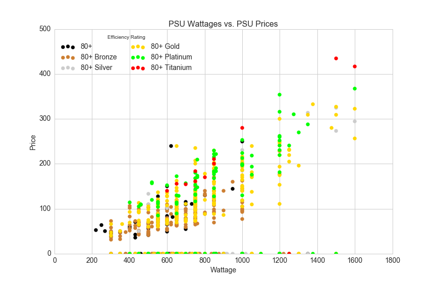
The data points along the x-axis are PSUs with no price data. There's a pretty nice correlation between watts and price, and Efficiency Rating should help make price predictions even more accurate than using wattage alone. A quick and easy way to determine how influential each feature of our data is on the target variable (price) is to train the data on machine learning algorithm called a random forest.
Before we run the random forest, categorical variable values must be replaced with integer values and we also need to remove PSUs with missing values. Here's a quick way to do that:
#all of the columns we will be working with
cols = [u'power', u'eff_rank', u'ppw', u'Manufacturer', u'Modular', u'Type', u'avg']
#feature columns (doesn't include average price or price per watt)
feature_cols = [u'power', u'eff_rank', u'Manufacturer', u'Modular', u'Type']
#drop null values and seperate X and y
X = df[cols].dropna()[feature_cols]
y = df[cols].dropna().avg
Running print X.shape, y.shape returns ((1100, 5), (1100,)), so we have 1100 observations of PSUs with complete data. We started with 1434 observations of PSUs, so my goal is to make predictions on PSU prices for the values with missing price data. (There may not be good enough feature data to make these predictions, but we won't worry about that for now). The next step is to map categorical variable values from strings to integers:
type_mapping = {x:y for x,y in zip(df.Type.unique(),range(len(df.Type.unique())))}
df.Type = df.Type.map(type_mapping)

modular_mapping = {x:y for x,y in zip(df.Modular.unique(),range(len(df.Modular.unique())))}
df.Modular = df.Modular.map(modular_mapping)

manufacturer_mapping = {x:y for x,y in zip(df.Manufacturer.unique(),range(len(df.Manufacturer.unique())))}
df.Manufacturer = df.Manufacturer.map(manufacturer_mapping)
Now we are ready to setup a random forest model. Here's the description of a random forest regressor from scikit-learn.org:
A random forest is a meta estimator that fits a number of classifying decision trees on various sub-samples of the dataset and use averaging to improve the predictive accuracy and control over-fitting.
from sklearn.ensemble import RandomForestRegressor
rfreg = RandomForestRegressor(n_estimators=150, max_features=4, oob_score=True, random_state=3)
rfreg.fit(X, y)
feature_importance = pd.DataFrame({'feature':feature_cols, 'importance':rfreg.feature_importances_}).sort_values(by='importance', ascending=False)
The feature_importance dataframe assigns a percentage representing how important each feature is in predicting the target variable, price.
| feature | importance |
|---|---|
| power | 0.674090 |
| eff_rank | 0.170238 |
| Manufacturer | 0.101809 |
| Modular | 0.033512 |
| Type | 0.020352 |
Looking at feature importance is a quick way evaluate the relative strength of each feature in a model. The results here aren't surprising: power is by far the most important feature, but eff_rank also has significant pull on the target variable (PSU price). The manufacturer, whether or not the PSU is modular and the type (form factor) are less important and could be ignored altogether in the next model.
We can dig a little bit deeper by searching for a n_estimators value that will minimize RMSE. n_estimators represents the number of decision trees used in the random forest regressor.
from sklearn.cross_validation import cross_val_score

#list of values to try for n_estimators
estimator_range = range(10, 310, 10)

#list to store the average RMSE for each value of n_estimators
RMSE_scores = []

#use 5-fold cross-validation with each value of n_estimators
for estimator in estimator_range:
    rfreg = RandomForestRegressor(n_estimators=estimator, random_state=1)
    MSE_scores = cross_val_score(rfreg, X, y, cv=5, scoring='mean_squared_error')
    RMSE_scores.append(np.mean(np.sqrt(-MSE_scores)))

# plot n_estimators (x-axis) versus RMSE (y-axis)
plt.plot(estimator_range, RMSE_scores)
plt.xlabel('n_estimators')
plt.ylabel('RMSE (lower is better)')
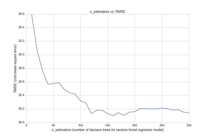
This graph shows the error in the model for 30 different settings of the parameter n_estimators. However, each time we test a new n_estimators value we are caluculating the error using cross-validation. Cross-validataion, or K-fold cross-validation helps improve the accuracy of error estimation by averaging the results of k models. In the model above, we see that cv=5, so we are running the model 5 times for every value of n_estimators, for a total of 150 times.
To find the optimal value of n_estimators we search for the value with the lowest error:
sorted(zip(RMSE_scores, estimator_range))[0]
(28.100834969072217, 160)
So, we get a slightly lower root mean squared error of 28.1 when we choose an n_estimators value of 160 (we started with n_estimators equal to 150).
We can do a quick test of the model by comparing the model's price predictions for certain PSUs to prices on Amazon.
Notice that there is a red point on the x-axis just beyond 1200 Watts. Let's predict the price for that PSU:
#filter the dataframe by 80+ Titanium rated PSUs that have a price of 0 and power over 1200 W
X_ = np.array(df[(df['Efficiency Certification']=='80+ Titanium')&(df.power>1200)&(df.avg==0)][feature_cols])
Let's get the index for this PSU:
df[(df['Efficiency Certification']=='80+ Titanium')&(df.power>1200)&(df.avg==0)].index
Int64Index([1260], dtype='int64')
Now we can make a prediction for price of this PSU:
rfreg.predict(df.ix[1260][feature_cols])
And the prediction we get for this model is $278.09. This product is listed on Amazon and NewEgg for $349.99, which means that our prediction fell short of the actual price by quite a bit (by $71.90).
A more practical approach for modeling PSU prices might be to simply make individual linear regressions for each Efficiency Certification. Here's a prediction for the same PSU using a linear regression of only a handful of 80+ Titanium rated PSUs:
df4 = df[(df.avg>0)&(df['Efficiency Certification']=='80+ Titanium')]
X = df4[['power']]
y = df4[['avg']]

from sklearn.linear_model import LinearRegression
reg = LinearRegression()
reg.fit(X,y)
print reg.predict([1250])
[[ 332.5585859]]
This prediction is much more accurate, and it falls right in line with a line-of-best-fit for the red points on the scatter plot above.
By visualizing power and efficiency rating vs. price in the graph above, we can see the strong correlation between wattage and price, and we can observe some general trends between different efficiency certifications: for any given power rating 80+ Titanium is generally more expensive than 80+ Platinum, and 80+ Platinum is generally more expensive than 80+ Bronze. 80+ Gold PSU prices seem to range quite a bit, so let's look at the distribution of 80+ Gold prices by manufacturer and form factor:
sns.plt.figure(figsize=(12,8))
plt.title('Average Price per Watt for 80+ Gold PSUs by Manufacturer', fontsize=14)
plt.xlabel('Manufacturer', fontsize=14)
plt.ylabel('Average Price per Watt', fontsize=14)
df[(df['Efficiency Certification']=='80+ Gold')&(df.power>0)&(df.avg>0)].groupby('Manufacturer').ppw.mean().sort_values().plot(kind='bar')
plt.savefig(os.path.expanduser('~/Documents/GitHub/briancaffey.github.io/img/psu/average_price_by_manufacturer.png'))
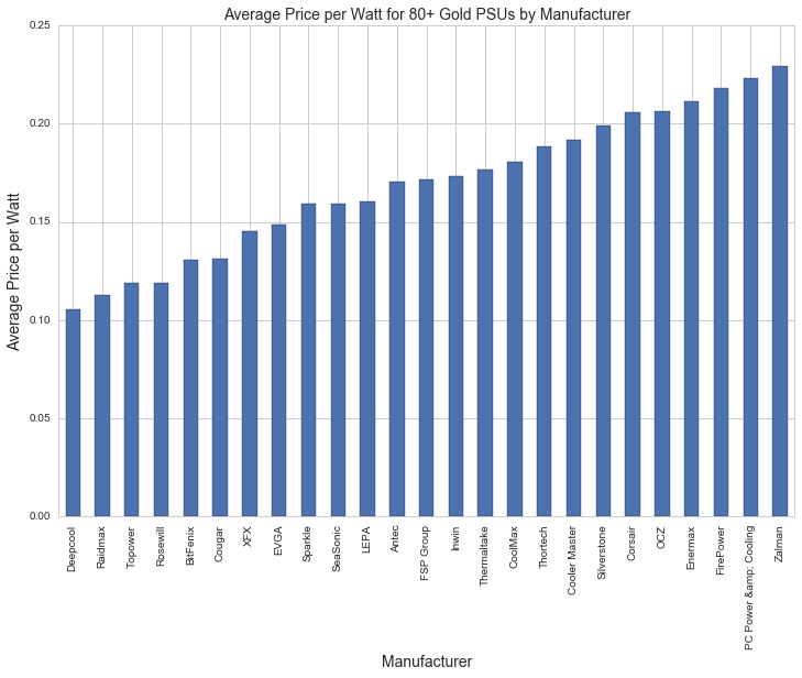
The most expensive 80+ Gold PSUs are more than twice as expensive as the cheapest PSUs by price per watt. This could explain the significance that the random forest regressor attached to this feature.
Whether or not a PSU is modular refers to the connectivity of power cables that come out of the PSUs. Fully modular means you can unplug all of the cables from the back and plug in only what you need for your PC. Semi modular means that there is one cable you can't unplug from the back (it is usually a 24-pin connector that plugs in to the motherboard), and other cables can be plugged in for graphics cards or other devices. 'No' means that all of the cables that you will need are permanently fixed to the PSU and you can't unplug anything. Here's a graph showing showing the distributions of price per watt by modular type (full, semi and none):
df[(df['Efficiency Certification']=='80+ Gold')&(df.avg>0)].boxplot(column='ppw', by='Modular', figsize=(12,8))
plt.ylim([0.07,0.3])
plt.suptitle('')
plt.ylabel('Price per Watt', fontsize=14)
plt.title('Price per Watt distributions of 80+ Gold PSUs by Modular Type', fontsize=14)
plt.xticks(fontsize=13)
plt.yticks(fontsize=13)
plt.savefig(os.path.expanduser('~/Documents/GitHub/briancaffey.github.io/img/psu/price_by_modular.png'))
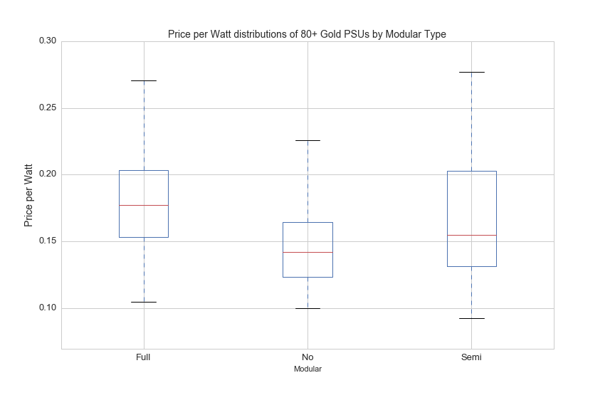
The distributions aren't surprising: fully-modular is more expensive than semi-modular, and semi-modular PSUs are more expensive than PSUs that are not modular. However, there is quite a bit of overlap in the prices of each modular type, so this feature only contributes roughly 3% of importance for predicting the price of PSUs with the random forest regressor model.
Motherboard
Motherboards are a critical part of any PC build. This component determines the compatability for most of the other components in a PC build, such as memory type, CPU socket, SSD drives types and SLI/CrossFire configurations (we'll get to what these mean soon).
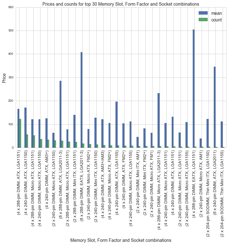
There are a lot of features to choose from, and most of the features in motherboard_csv.csv are categorical variables, some containing over 100 unique values. We can use df.groupby() to look popular combinations of motherboard features. There are 26 CPU socket types, 11 different form factors and 14 memory slot types. There are a total of 60 unique combinations for these three motherboard features, the combinations with the most motherboards are shown below along with average prices:
df[(df.avg>0)].groupby(['Memory Slots','Form Factor', 'socket']).avg.agg(['mean', 'count']).sort_values(by='count', ascending=False)[:30].plot(kind='bar', figsize=(10,4))
plt.title('Prices and counts for top 30 Memory Slot, Form Factor and Socket combinations')
plt.xlabel('Memory Slot, Form Factor and Socket combinations')
plt.figure()
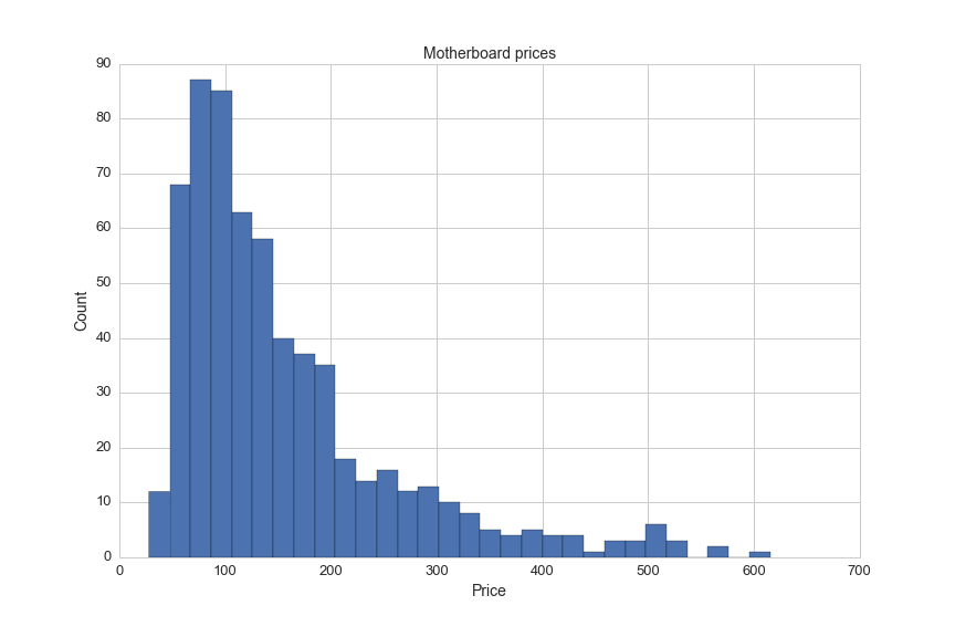
Of the 2400 motherboards in the dataset, there is price information for only 618 motherboards. The average motherboard price is $157.50. Here's a visualizations of motherboard prices:
plt.figure(figsize=(12,8))
df[(df.avg!=0)&(df.avg<750)].avg.hist(bins=30)
plt.title('Motherboard prices', fontsize=14)
plt.xlabel('Price', fontsize=14)
plt.ylabel('Count', fontsize=14)
plt.xticks(fontsize=13)
plt.yticks(fontsize=13)
plt.savefig(os.path.expanduser('~/Documents/GitHub/briancaffey.github.io/img/motherboard/price_histogram.png'))
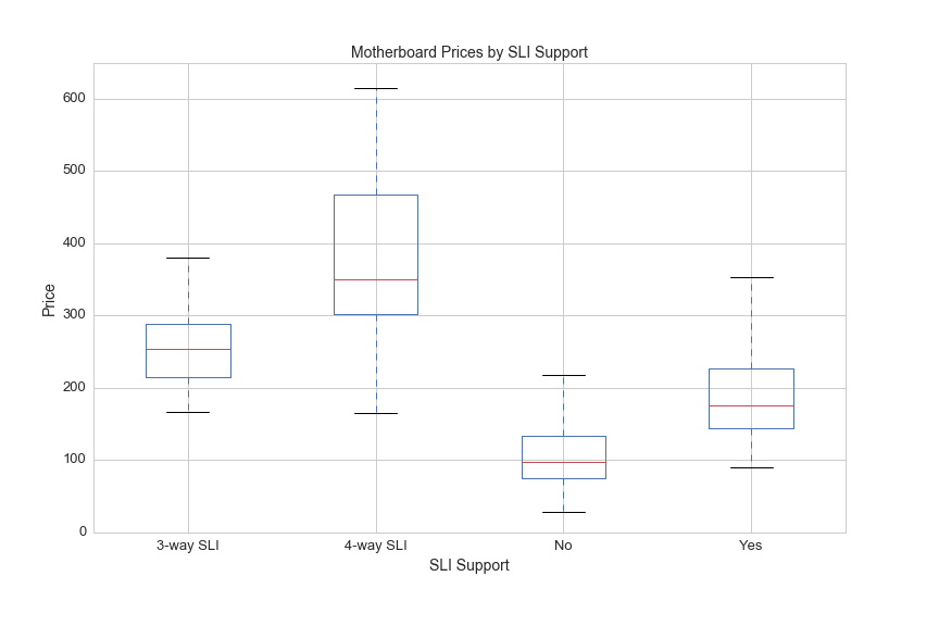
Another feature that may be indicative of price is SLI support. Here's a description of SLI from a superuser forum post:
Scalable Link Interface (SLI) is a brand name for a multi-GPU solution developed by NVIDIA for linking two or more video cards together to produce a single output. SLI is an application of parallel processing for computer graphics, meant to increase the processing power available for graphics.
The SLI Support feature values include NaN, Yes, 3 and 4. Intuition tells me that a motherboard supporting 4 graphics cards will be more expensive than motherboard supporing only graphics cards.
Here's a look at motherboard prices by SLI Support:
df[df.avg>0].boxplot(column='avg', by='SLI Support', figsize=(12,8))
plt.ylim([0,650])
plt.suptitle('')
plt.title('Motherboard Prices by SLI Support',fontsize=14)
plt.xlabel('SLI Support',fontsize=14)
plt.ylabel('Price', fontsize=14)
plt.xticks(fontsize=13)
plt.yticks(fontsize=13)
plt.savefig(os.path.expanduser('~/Documents/GitHub/briancaffey.github.io/img/motherboard/SLI_prices.png'))
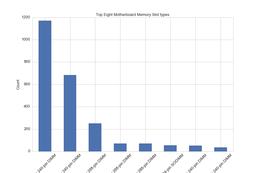
Memory slots on motherboard determine what type of memory and how much memory can be included in a PC. The amount of memory is also limited by the maximum supported memory of the CPU. Here'a a breakdown of the count of motherboards by memory type:
df['Memory Slots'].value_counts()[:8].plot(kind='bar', rot=45, figsize=(12,8))
plt.title('Top Eight Motherboard Memory Slot types', fontsize=13)
plt.ylabel('Count', fontsize=13)
plt.xlabel('Memory Slot types', fontsize=13)
plt.xticks(fontsize=13)
plt.yticks(fontsize=13)
plt.savefig(os.path.expanduser('~/Documents/GitHub/briancaffey.github.io/img/motherboard/motherboard_count_by_mem_type.png'))
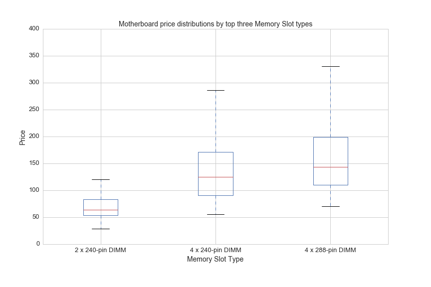
And here are price boxplots for the top three most common memory slot types:
df[(df.avg>0)&((df['Memory Slots']=='4 x 240-pin DIMM')|(df['Memory Slots']=='2 x 240-pin DIMM')|\
              (df['Memory Slots']=='4 x 288-pin DIMM'))].boxplot(column='avg', by='Memory Slots', figsize=(12,8))
plt.ylim([0,400])
plt.suptitle('')
plt.title('Motherboard price distributions by top three Memory Slot types', fontsize=14)
plt.xlabel('Memory Slot Type',fontsize=14)
plt.ylabel('Price', fontsize=14)
plt.xticks(fontsize=13)
plt.yticks(fontsize=13)
plt.savefig(os.path.expanduser('~/Documents/GitHub/briancaffey.github.io/img/motherboard/prices_by_mem_slot.png'))
Now let's perform a random forest regression for motherboards in the same way we did for PSUs to rank the importance of these features.
First we need to map categorical variable values to integers:
#map categorical variable values to integers
chipset_mapping = {x:y for x,y in zip(df.Chipset.unique(),range(len(df.Chipset.unique())))}
df['Chipset_int'] = df.Chipset.map(chipset_mapping)

socket_mapping = {x:y for x,y in zip(df.socket.unique(),range(len(df.socket.unique())))}
df['socket_int'] = df.socket.map(socket_mapping)

df['Form_Factor'] = df['Form Factor']
form_factor_mapping = {x:y for x,y in zip(df.Form_Factor.unique(),range(len(df.Form_Factor.unique())))}
df['Form_Factor_int'] = df.Form_Factor.map(form_factor_mapping)

df['Memory_Type'] = df['Memory Type']
memory_type_mapping = {x:y for x,y in zip(df.Memory_Type.unique(),range(len(df.Memory_Type.unique())))}
df['Memory_Type_int'] = df.Memory_Type.map(memory_type_mapping)

df['Memory_Slots'] = df['Memory Slots']
memory_slots_mapping = {x:y for x,y in zip(df.Memory_Slots.unique(),range(len(df.Memory_Slots.unique())))}
df['Memory_Slots_int'] = df.Memory_Slots.map(memory_slots_mapping)

manufacturer_mapping = {x:y for x,y in zip(df.Manufacturer.unique(),range(len(df.Manufacturer.unique())))}
df['Manufacturer_int'] = df.Manufacturer.map(manufacturer_mapping)

df['SLI_Support'] = df['SLI Support']
sli_mapping = {x:y for x,y in zip(df.SLI_Support.unique(),range(len(df.SLI_Support.unique())))}
df['SLI_Support_int'] = df.SLI_Support.map(sli_mapping)
And then drop null values and separate X and y:
cols = ['avg', 'max_mem', 'Memory_Slots_int', 'SLI_Support_int', 'Memory_Type_int', 'Form_Factor_int', 'socket_int','Chipset_int']
feature_cols = ['max_mem', 'Memory_Slots_int', 'SLI_Support_int','Memory_Type_int', 'Form_Factor_int', 'socket_int','Chipset_int']
X = df[cols][df.avg>0].dropna()[feature_cols]
y = df[cols][df.avg>0].avg
Now we setup the model and take a look at the results .feature_importances_:
from sklearn.ensemble import RandomForestRegressor
# max_features=8 is best and n_estimators=150 is sufficiently large
rfreg = RandomForestRegressor(n_estimators=80, max_features=6, oob_score=True, random_state=5)
rfreg.fit(X, y)
feature_importance = pd.DataFrame({'feature':feature_cols, 'importance':rfreg.feature_importances_}).sort_values(by='importance', ascending=False)
print feature_importance
| feature | importance |
|---|---|
| Memory_Slots_int | 0.352454 |
| SLI_Support_int | 0.155018 |
| Memory_Type_int | 0.127274 |
| Form_Factor_int | 0.113944 |
| Chipset_int | 0.088664 |
| max_mem | 0.085077 |
| socket_int | 0.077571 |
And finally we can test the accuracy of the model by searching for an optimal n_estimators number of decision trees with 5-fold cross validation:
from sklearn import metrics
from sklearn.cross_validation import cross_val_score

# list of values to try for n_estimators
estimator_range = range(10, 310, 10)

# list to store the average RMSE for each value of n_estimators
RMSE_scores1 = []

# use 5-fold cross-validation with each value of n_estimators (WARNING: SLOW!)
for estimator in estimator_range:
    rfreg = RandomForestRegressor(n_estimators=estimator, random_state=1)
    MSE_scores = cross_val_score(rfreg, X, y, cv=5, scoring='mean_squared_error')
    RMSE_scores1.append(np.mean(np.sqrt(-MSE_scores)))


plt.figure(figsize=(12,8))
plt.xlabel('n_estimators', fontsize=14)
plt.ylabel('RMSE (root-mean-sqaure error)', fontsize=14)
plt.plot(estimator_range, RMSE_scores1)
plt.xticks(fontsize=13)
plt.yticks(fontsize=13)
plt.savefig(os.path.expanduser('~/Documents/GitHub/briancaffey.github.io/img/motherboard/n_est_vs_rmse.png'))
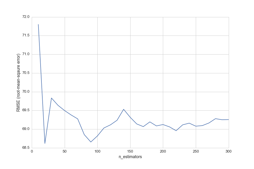
The predictive accuracy is not great. Let's look at a few random motherboards with no pricing data and compare the model's prediction to prices on Amazon.
df[df.avg==0].sample(1)['Part #']
1710 GA-Z97X-SOC FORCE
This is a random sample with no pricing data, and its index value is 1710.
The following will give us a prediction based on our model:
rfreg.predict(np.array(df.ix[1710][feature_cols]))
array([ 203.90425])
This product is available used on Amazon for $249.00, so we have fairly significant error in this one prediction.
Here's one more example that I will cherry-pick:
df[df.avg==0].sample(1)['Part #']
234 A76ML-K 3.0
rfreg.predict(np.array(df.ix[234][feature_cols]))
array([ 82.61848925])
This product is available on NewEgg.com for $57.95 (currently on sale for $39.95). Our model's prediction for this product price is slightly more accurate, but it also reveals a problem with trying to fill the missing data in this data set.
Most of the motherboards with no pricing data in the dataset are out of stock on all major online retailers and are also quite old. In the next part of this project we will be able to see how much pricing data is missing in the collection of 25,000 PC builds on PCPartPicker. I am anticipating that there will be very little missing data since people are building with new hardware.
CPU
CPU price and performance are determined by several features, so I'll go through them one by one and show interesting relationships among different features and between features and price.
Lithography
One interesting feature of CPUs that distinguishes Intel and AMD (the two CPU manufacturers) is lithography. Lithography can be described as the average space between a processor's transistors, and it is an important factor that determines clock speed and power consumption. This graph shows lithography vs. CPU price for CPUs priced under $750:
plt.figure(figsize=(12,4))
sns.set_style('whitegrid')
plt.axis([0,70,0,750])
plt.xlabel('Lithography', fontsize=14)
plt.title('CPU Lithography and Price', fontsize=14)
plt.ylabel('Price', fontsize=14)
plt.scatter(df[df.Manufacturer=="Intel"].Lithography, df[df.Manufacturer=="Intel"].avg, alpha=.2, color='blue', s=50)
plt.scatter(df[df.Manufacturer=="AMD"].Lithography, df[df.Manufacturer=="AMD"].avg, alpha=.2, color='red', s=50 )
plt.legend(['Intel','AMD'], fontsize=14)
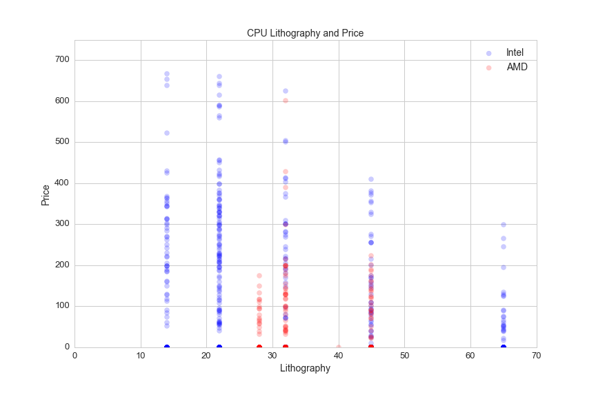
Intel's 22 nm and 14 nm lithography set it apart from AMD. From what I understand, AMD contracts its semi-conducter fabrication to other companies and Intel has its own advanced fabrication processes.
Clock speed, CPU cores
CPU speed is measured in clock cycles. A clock cycle is the amount of time between two pulses of an oscillator (something that goes back and forth), and it helps determine the amount of instructions that the CPU can execute per second. Clock cycles used to be the best way to measure the speed of a CPU, but developments around 2005 in CPU architecture (and computer applications) have added other important features that must be considered alongside clock speed when determining the power of a PC.
Engineers had difficulty increasing clock speeds, so they started to develop multi-core processors. It's helpful to think of CPUs and CPUs cores like a kitchen. A single-core CPU is like a CPU with one cook, and is limited by how fast the cook can make food. Adding cores to a CPU can be thought of as adding cooks to the kitchen. The cooks don't get faster, but the productivity of the kitchen increases. Here's a look at the distribution of clock speeds by CPU:
df[(df.cores>0)&(df.avg>0)].boxplot(column='opfreq', by='cores', figsize=(12,8))
plt.suptitle('')
plt.title('CPU Operating Frequency by Core count', fontsize=14)
plt.xlabel('CPU Core count', fontsize=14)
plt.ylabel('Clock speed (MHz)', fontsize=14)
plt.xticks(fontsize=13)
plt.yticks(fontsize=13)
plt.savefig(os.path.expanduser('~/Documents/GitHub/briancaffey.github.io/img/cpu/speed_vs_cores.png'))
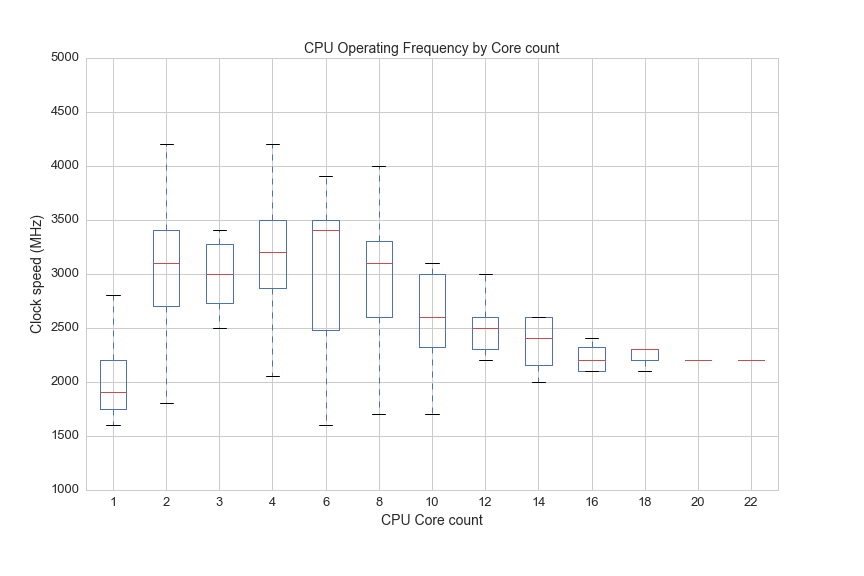
So once there are 22 cooks in the kitchen, everyone has to go slower, but the team of cooks can easily handle things that would totally swamp an individual cook, like rendering 4K video while live-streaming a AAA title at 1080p60.
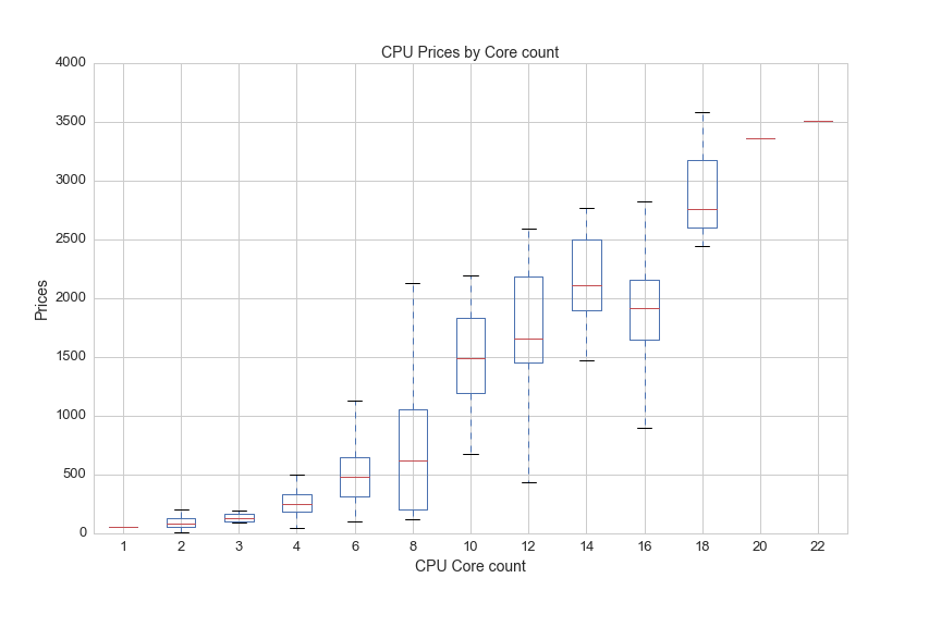
You have to pay for each cook, so the core count has a big impact on CPU price:
df[(df.cores>0)&(df.avg>0)].boxplot(column='avg', by='cores', figsize=(12,8))
plt.suptitle('')
plt.title('CPU Prices by Core count', fontsize=14)
plt.xlabel('CPU Core count', fontsize=14)
plt.ylabel('Prices', fontsize=14)
plt.xticks(fontsize=13)
plt.yticks(fontsize=13)
plt.savefig(os.path.expanduser('~/Documents/GitHub/briancaffey.github.io/img/cpu/price_by_core.png'))
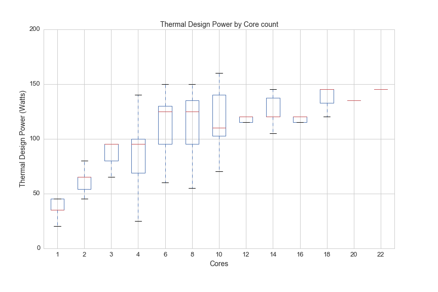
A kitchen with 22 cooks gets very hot in the same way that a CPU with 22 cores generates a lot of heat. The next graph shows how much heat (measured in something called TDP, or thermal design power) CPUs generate by core count:
df.boxplot(column='TDP', by='Cores', figsize=(12,8))
plt.suptitle('')
plt.ylim(0,200)
plt.title('Thermal Design Power by Core count', fontsize=14)
plt.xlabel('Cores', fontsize=14)
plt.ylabel('Thermal Design Power (Watts)', fontsize=14)
plt.xticks(fontsize=13)
plt.yticks(fontsize=13)
plt.savefig(os.path.expanduser('~/Documents/GitHub/briancaffey.github.io/img/cpu/tdp_by_cores.png'))
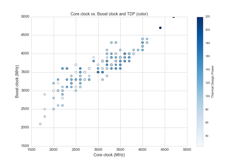
Thermal Design Power (TDP)
Here is a desrciption of TDP from the Wikipedia article on Thermal Design Power:
The thermal design power (TDP), sometimes called thermal design point, is the maximum amount of heat generated by a computer chip or component (often the CPU or GPU) that the cooling system in a computer is designed to dissipate in typical operation.
This is a specification for any type of processor and it is measured in joules per second (or watts) produced by the CPU while it performs a computationally intensive task. Each point on the following scatter plot shows core clock and boost clock speeds with color representing TDP:
plt.figure(figsize=(12,8))
plt.subplot(111)
df1 = df[(df.opfreq>0)&(df.turbo>0)]
plt.scatter(df1.opfreq, df1.turbo ,c=df1.TDP, s=60, cmap='Blues')
plt.colorbar(label='Thermal Design Power')
plt.title('Core clock vs. Boost clock and TDP (color)', fontsize=14)
plt.ylabel('Boost clock (MHz)', fontsize=14)
plt.xlabel('Core clock (MHz)', fontsize=14)
plt.axis([1500,5000,1500,5000])
Here are two more graphs that show the relationship between clock speed, core count, TDP and price:
plt.figure(figsize=(12,8))
df2 = df[(df.avg>0)&(df['Hyper-Threading']=="Yes")]
plt.scatter(df2.opfreq, df2.Cores, c=df2.avg, s=df2.TDP*2, cmap='Blues')
plt.colorbar(label='Price')
plt.title('Frequency vs. Core count for \n Color: Price; Size:TPD', fontsize=14)
plt.ylabel('Cores', fontsize=14)
plt.xlabel('Operating Frequency', fontsize=14)
plt.xticks(fontsize=13)
plt.yticks(fontsize=13)
plt.savefig(os.path.expanduser('~/Documents/GitHub/briancaffey.github.io/img/cpu/freq_v_cores.png'))
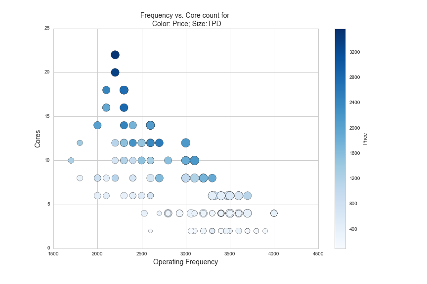
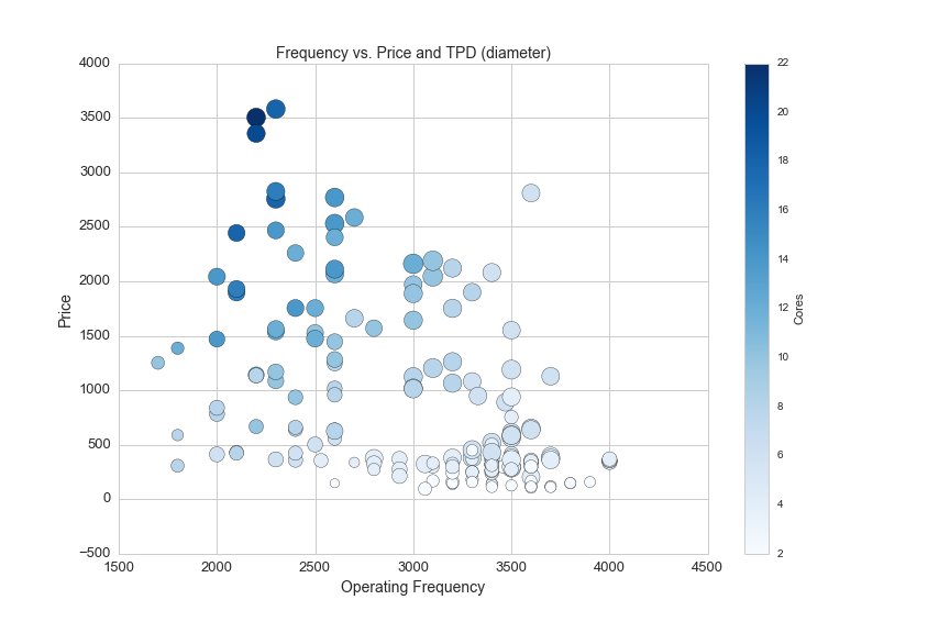
The CPUs shown in the graph above are all Intel CPUs that utilize a proprietary technology called hyper-threading. Hyper-threading is a new feature on CPUs that allows them to better schedule the tasks that they do so that they can minimize the time the need to wait for information to process. Another good analogy I have heard to explain hyper-threading is eating M&Ms as fast as possible with one hand vs. two hands. Hyper-threading is like using two hands to eat M&Ms, while you are eating an M&M with your left hand, your right hand is retrieving the next M&M from the bowl. Here is the same data with price on the y-axis and core count by color:
plt.figure(figsize=(12,8))
df2 = df[(df.avg>0)&(df['Hyper-Threading']=="Yes")]
plt.scatter(df2.opfreq, df2.avg, c=df2.Cores, s=df2.TDP*2, cmap='Blues')
plt.colorbar(label='Cores')
plt.title('Frequency vs. Price and TPD (diameter)', fontsize=14)
plt.ylabel('Price', fontsize=14)
plt.xlabel('Operating Frequency', fontsize=14)
plt.xticks(fontsize=13)
plt.yticks(fontsize=13)
plt.savefig(os.path.expanduser('~/Documents/GitHub/briancaffey.github.io/img/cpu/freq_v_price.png'))
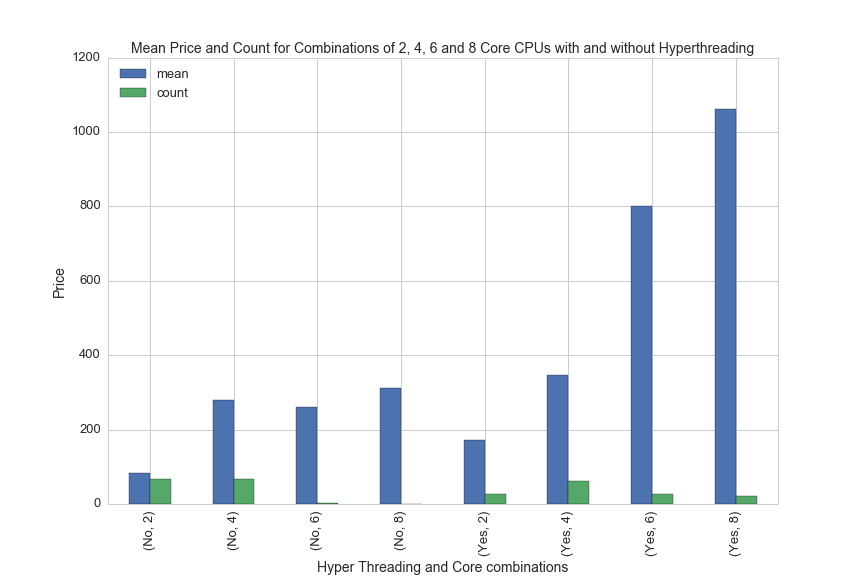
And finally, here is one more graph showing the difference in price between CPUs with and without hyperthreading technology:
df['Hyper_Threading'] = df['Hyper-Threading']
df[(df.Manufacturer=='Intel')&(df.avg>0)&((df.Cores==4)|(df.Cores==2)|(df.Cores==6)|(df.Cores==8))].groupby(['Hyper_Threading','Cores']).avg.agg(['mean', 'count']).plot(kind='bar', figsize=(12,8))
plt.xlabel('Hyper Threading and Core combinations', fontsize=14)
plt.ylabel('Price', fontsize=14)
plt.title('Mean Price and Count for Combinations of 2, 4, 6 and 8 Core CPUs with and without Hyperthreading', fontsize=14)
plt.legend(loc='upper left', fontsize=14)
plt.xticks(fontsize=13)
plt.yticks(fontsize=13)
plt.legend(fontsize=13, loc='upper left')
plt.savefig(os.path.expanduser('~/Documents/GitHub/briancaffey.github.io/img/cpu/hyper_threading_prices.png'))
CPU Cooler
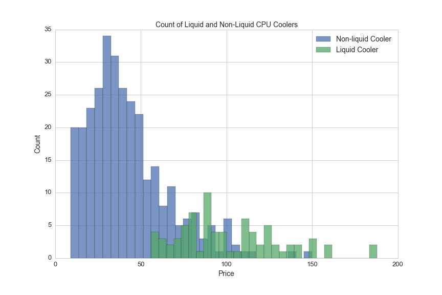
To manage the small amount of heat that is generated at each clock cycle it is necessary to direct heat away from the CPU. This brings us to CPU coolers, the next major class of PC components. Cooling a CPU is achieved with large blocks of aluminum that are attached to the CPU with thermal paste. Aluminum conducts heat well, so the heat is dispersed into fins and the fins are then cooled with fans, or a liquid passes over the cooling block and is sent through a radiator which is cooled with fans.
Here's a comparison of the number of liquid vs. non-liquid CPU coolers broken down by price:
plt.figure(figsize=(12,8))
plt.hist(df[(df.avg>0)&(df.liquid=="No")].avg, bins = 30, alpha=.75, label='Non-liquid Cooler')
df[(df.avg>0)&(df.liquid=="Yes")].avg.hist(bins=30, alpha=.75, label='Liquid Cooler')
plt.legend(loc='upper right', fontsize=14)
plt.title('Count of Liquid and Non-Liquid CPU Coolers', fontsize=14)
plt.xlabel('Price', fontsize=14)
plt.ylabel('Count', fontsize=14)
plt.xticks(fontsize=13)
plt.yticks(fontsize=13)
plt.savefig(os.path.expanduser('~/Documents/GitHub/briancaffey.github.io/img/cpu_cooler/prices_hist.png'))
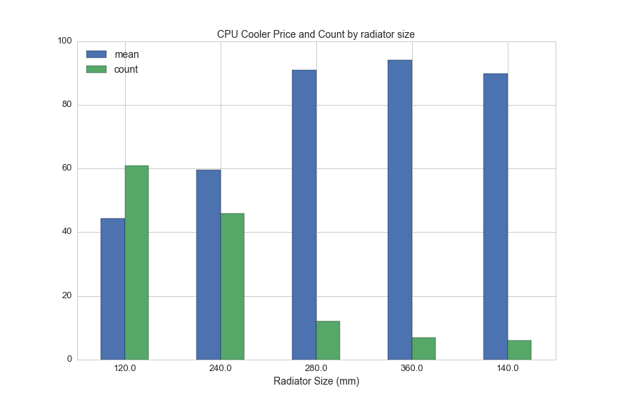
Liquid coolers come with radiators in five different sizes. This chart shows average prices for liquid coolrs by radiator length:
df[df.liquid=="Yes"].groupby('rad_size').avg.agg(['mean', 'count']).sort_values('count', ascending=False).plot(kind='bar', figsize=(12,8), rot=0)
plt.title('CPU Cooler Price and Count by radiator size', fontsize=14)
plt.legend(loc='upper left', fontsize=14)
plt.xlabel('Radiator Size (mm)', fontsize=14)
plt.xticks(fontsize=13)
plt.yticks(fontsize=13)
plt.savefig(os.path.expanduser('~/Documents/GitHub/briancaffey.github.io/img/cpu_cooler/rad_vs_price.png'))
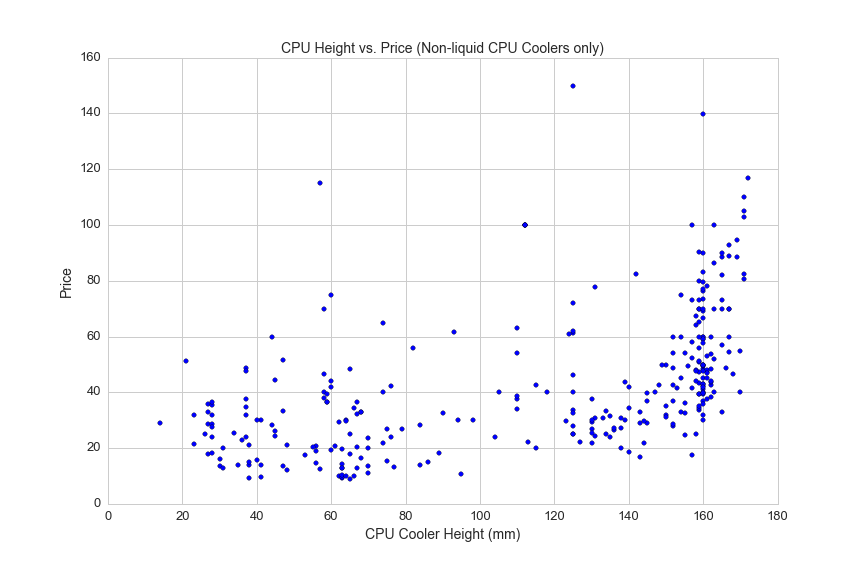
Non-liquid coolers can be quite large and bulky to allow for more heat dispersion. Here's a scatterplot showing CPU cooler height and prices:
df1 = df[(df.avg>0)&(df.cooler_height>0)]
plt.figure(figsize=(12,8))
plt.scatter(df1.cooler_height, df1.avg)
plt.title('CPU Height vs. Price (Non-liquid CPU Coolers only)', fontsize=14)
plt.xlabel('CPU Cooler Height (mm)', fontsize=14)
plt.ylabel('Price', fontsize=14)
plt.xticks(fontsize=13)
plt.yticks(fontsize=13)
plt.savefig(os.path.expanduser('~/Documents/GitHub/briancaffey.github.io/img/cpu_cooler/cooler_height.png'))
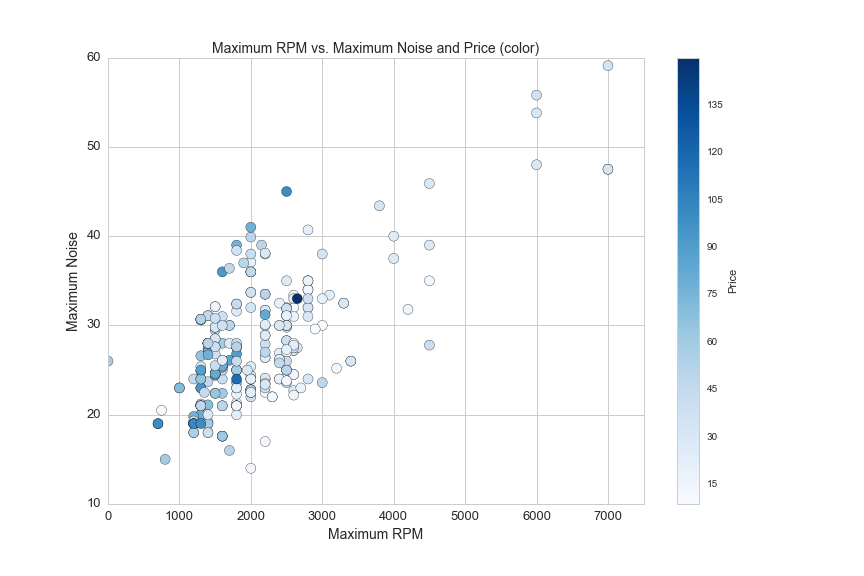
Here's one more graph on non-liquid coolers showing the relationship between maximum fan RPM and the maximum level of noise generated by the cooler:
plt.figure(figsize=(12,8))
df1 = df[(df.liquid=='No')&(df.avg>0)]
plt.scatter(df1.rpm_max, df1.max_noise, s=100, c = df1.avg, cmap='Blues')
plt.colorbar(label='Price')
plt.axis([0,7500,10,60])
plt.xlabel('Maximum RPM', fontsize=14)
plt.ylabel('Maximum Noise', fontsize=14)
plt.title('Maximum RPM vs. Maximum Noise and Price (color)', fontsize=14)
plt.xticks(fontsize=13)
plt.yticks(fontsize=13)
plt.savefig(os.path.expanduser('~/Documents/GitHub/briancaffey.github.io/img/cpu_cooler/rpm_vs_noise.png'))
Memory
Memory is another important PC component that is particularlly important for content creators working with large video files. Memory speed and type are also important for benchmarking performed by hard-core PC gaming. PC memory is analogous to the space on your desk whereas hard drive disks are like file cabinets behind your desk. Things stored in memory can be accessed very quickly, but if you don't have enough memory then papers will start falling off of your desk and your application will crash becuase it won't be able to find what it is looking for, or won't have any space to put new information that it may need.
Here's a linear regression that captures the relationship between memory size and price:
from sklearn.linear_model import LinearRegression
lreg = LinearRegression()
df1 = df[df.avg>0]
feat_cols = [u'size_gb']
X = df1[feat_cols]
y = df1.avg.reshape(df1.size_gb.shape[0],1)
lreg.fit(X, y, sample_weight=None)

#plot memory size vs. price
plt.figure(figsize=(12,8))
plt.scatter(df[df.avg>0].size_gb, df[df.avg>0].avg, s = 100, alpha=.05)
plt.axis([0,130,0,1100])
plt.title('Memory Kit prices by Size (GB)', fontsize=14)
plt.xlabel('Memory Kit Size (GB)', fontsize=14)
plt.ylabel('Price', fontsize=14)

#plot regression line
size = df1.size_gb.reshape(df1.size_gb.shape[0],1)
pred = lreg.predict(df1.size_gb.reshape(df1.size_gb.shape[0],1))
plt.plot(size ,pred, color='red')
plt.savefig(os.path.expanduser('~/Documents/GitHub/briancaffey.github.io/img/memory/size_vs_price.png'))
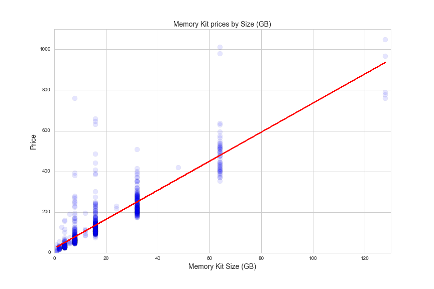
The R^2 value from the regression is 0.767, which means that 76 percent of the variation in the data is explained by the model. The variation might come from the fact that there are two important features that differentiate regular memory from enthusiast-grade memory: memory speed and CAS.
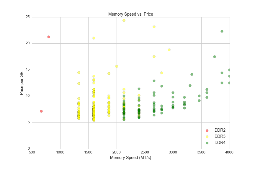
Memory module speed is measured in megatransfers per second (MT/s). Here is a graph of memory speeds vs. prices:
plt.figure(figsize=(12,8))
a=.5
s=75

ddr2_speed = df.ddr_speed[(df.ddr_type == 'DDR2')&(df.size_gb==8)&(df.ddr_speed>0)&(df.avg>0)]
ddr2_ppgb = df.ppgb[(df.ddr_type == 'DDR2')&(df.size_gb==8)&(df.ddr_speed>0)&(df.avg>0)]
plt.scatter(ddr2_speed,ddr2_ppgb,alpha = a, c='red', s=s)

ddr3_speed = df.ddr_speed[(df.ddr_type == 'DDR3')&(df.size_gb==8)&(df.ddr_speed>0)&(df.avg>0)]
ddr3_ppgb = df.ppgb[(df.ddr_type == 'DDR3')&(df.size_gb==8)&(df.ddr_speed>0)&(df.avg>0)]
plt.scatter(ddr3_speed,ddr3_ppgb,alpha = a, c='yellow', s=s)

ddr4_speed = df.ddr_speed[(df.ddr_type == 'DDR4')&(df.size_gb==8)&(df.ddr_speed>0)&(df.avg>0)]
ddr4_ppgb = df.ppgb[(df.ddr_type == 'DDR4')&(df.size_gb==8)&(df.ddr_speed>0)&(df.avg>0)]
plt.scatter(ddr4_speed,ddr4_ppgb,alpha = a, c='green', s=s)

plt.axis([500,4000,0,25])
plt.xlabel('Memory Speed (MT/s)', fontsize=14)
plt.ylabel('Price per GB', fontsize=14)
plt.title("Memory Speed vs. Price", fontsize=14)
plt.legend(['DDR2', 'DDR3', 'DDR4'], loc='lower right', fontsize=14)
plt.xticks(fontsize=13)
plt.yticks(fontsize=13)
plt.savefig(os.path.expanduser('~/Documents/GitHub/briancaffey.github.io/img/memory/speed_vs_price.png'))
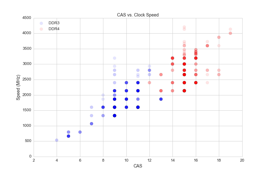
CAS stands for column access strobe (CAS) latency, and it is the delay time between the moment a memory controller tells the memory module to access a particular memory column on a RAM module, and the moment the data from the given array location is available on the module's output pins (from the Wikipedia article on CAS latency).
On synchronous dynamic random-access memory modules like the ones used in modern PCs, CAS is measured in clock cycles and ranges from 4 to 20. Here's a look at memory speeds and their CAS latency:
plt.figure(figsize=(12,8))
s = 100
a = 0.1

#plot ddr3
ddr3_cas = df.CAS[(df.is_ddr4 == False)&(df.avg>0)]
ddr3_speed = df.ddr_speed[(df.is_ddr4 == False)&(df.avg>0)]
plt.scatter(ddr3_cas,ddr3_speed, c = 'blue', s=s, alpha=a)

#plot ddr4
ddr4_cas = df.CAS[(df.is_ddr4 == True)&(df.avg>0)]
ddr4_speed = df.ddr_speed[(df.is_ddr4 == True)&(df.avg>0)]
plt.scatter(ddr4_cas,ddr4_speed, c = 'red', s = s, alpha=a)

plt.xlabel('CAS', fontsize=14)
plt.ylabel('Speed (MHz)', fontsize=14)
plt.title("CAS vs. Clock Speed", fontsize=14)
plt.xticks(fontsize=13)
plt.yticks(fontsize=13)
plt.legend(['DDR3', 'DDR4'], loc='upper left', fontsize=13)
plt.savefig(os.path.expanduser('~/Documents/GitHub/briancaffey.github.io/img/memory/cas_vs_speed.png'))
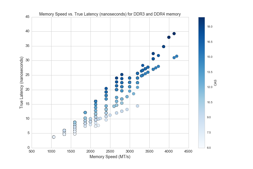
It's a misconception that faster memory has higher latency, because CAS is not actually a good representation of memory's latency. This is because it is measured in clock cycles, which become smaller as the memory clock speed increases. Here's how the math for memory and true latency works out:
true latency (nanoseconds) = clock cycle time (nanoseconds) x CAS (clock cycles)
So here's how we can calculate true latency using the data in the dataset:
#filter for DDR4 memory with valid CAS
df_lat = df[(df.CAS>0)&(df.ddr_speed>0)&(df.ddr_type=='DDR4')]
df_lat['true_latency'] = [((x/2.)/1000.)*y for x, y in zip(df_lat.ddr_speed, df_lat.CAS)]
Let's calculate the true latency of two different memory modules: DDR4-2666/CAS18 and DDR3-1333/CAS9.
The 'DDR' in DDR memory stands for double data rate, which means that information is transfared twice per clock cycle. Because of this, we must first take the MT/s rate and divide by 2 to calculate the clock speed. Next we need to find how long each clock cycle takes. To find this amount of time we can divide 1 by the frequency. Finally we multiply the time of one clock cycle by the CAS (the latency in number cycles) to get the latency in seconds (nanoseconds):
DDR4-2666
2666 MT/s
2666000000 T/s
1333000000 Hz
1/(1333000000 Hz)
0.00000000075 s
0.75 nanoseconds = 1 clock cycle

true latency = clock cycle x CAS
true latency = 0.75 ns x 18
true latency = 13.5 nanoseconds

DDR3-1333
1333 MT/s
1333000000 T/s
666500000 Hz
1/(666500000 Hz)
0.0000000015 seconds
1.5 nanoseconds = 1 clock cycle

true latency = clock cycle x CAS
true latency = 1.5 ns x 9
true latency = 13.5 nanoseconds
Here's an article from Crucial, a major memory manufacturer, that explains this idea fully. The main conclusion is that speed is more important than memory, but the two measurements must be considered together.
The equation for true_latency above divides half the DDR MT/s rate by 1000 to both multiply by 10^6 (for converting MT/s to T/s) and divide by 10^9 (for converting seconds to nano seconds).
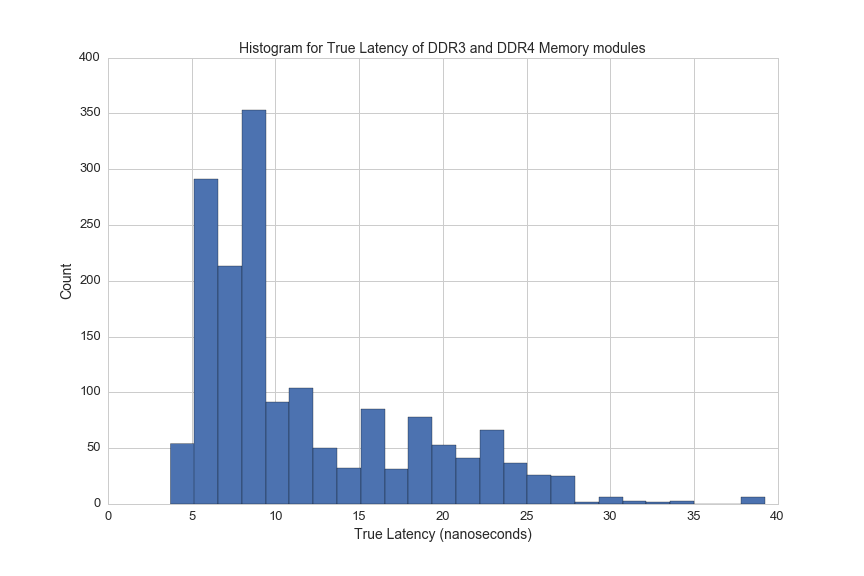
Here's a histogram of true latency for DDR4 memory modules:
df_lat = df[(df.CAS>0)&(df.ddr_speed>0)&((df.ddr_type=='DDR4')|(df.ddr_type=='DDR3'))]
df_lat['true_latency'] = [((x/2.)/1000.)*y for x, y in zip(df_lat.ddr_speed, df_lat.CAS)]
df_lat.true_latency.hist(bins=25, figsize=(12,8))
plt.xlabel('True Latency (nanoseconds)', fontsize=14)
plt.ylabel('Count', fontsize=14)
plt.title("Histogram for True Latency of DDR3 and DDR4 Memory modules", fontsize=14)
plt.xticks(fontsize=13)
plt.yticks(fontsize=13)
plt.savefig(os.path.expanduser('~/Documents/GitHub/briancaffey.github.io/img/memory/true_latency.png'))
Here's an graph from the Crucial article showing speed vs true latency:
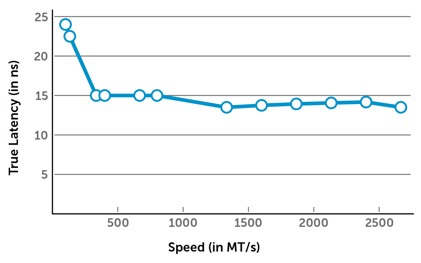
And here is a similar graph from our dataset:
df_lat = df[(df.CAS>0)&(df.ddr_speed>0)&((df.ddr_type=='DDR4')|(df.ddr_type=='DDR3'))]
df_lat['true_latency'] = [((x/2.)/1000.)*y for x, y in zip(df_lat.ddr_speed, df_lat.CAS)]
plt.figure(figsize=(12,8))
plt.scatter(df_lat.ddr_speed, df_lat.true_latency)
plt.xlabel('Memory Speed (MT/s)', fontsize=14)
plt.ylabel('True Latency (nanoseconds)', fontsize=14)
plt.title('Memory Speed vs. True Latency (nanoseconds) for DDR3 and DDR4 memory', fontsize=14)
plt.xticks(fontsize=13)
plt.yticks(fontsize=13)
plt.savefig(os.path.expanduser('~/Documents/GitHub/briancaffey.github.io/img/memory/speed_vs_true_latency.png'))
Here's another look at memory prices, showing memory module prices and price per GB of memory:
plt.figure(figsize=(12,8))
s_8 = df1[df1.size_gb==8]
s_16 = df1[df1.size_gb==16]
s_32 = df1[df1.size_gb==32]
s_4 = df1[df1.size_gb==4]
s_64 = df1[df1.size_gb==64]
s_2 = df1[df1.size_gb==2]

plt.scatter(s_2.avg, s_2.ppgb, c='orange', s=50)
plt.scatter(s_4.avg, s_4.ppgb, c='red', s=50)
plt.scatter(s_8.avg, s_8.ppgb, c='black', s=50)
plt.scatter(s_16.avg, s_16.ppgb, c='green', s=50)
plt.scatter(s_32.avg, s_32.ppgb, c='blue', s=50)
plt.scatter(s_64.avg, s_64.ppgb, c='yellow', s=50)


plt.axis([0,600,0,30])
plt.title('Memory Kit Price vs. Price per GB', fontsize=14)
plt.xlabel('Memory Kit Price', fontsize=14)
plt.ylabel('Memory Kit Price per GB', fontsize=14)
plt.xticks(fontsize=13)
plt.yticks(fontsize=13)
plt.legend(['2GB','4GB', '8GB', '16GB', '32GB', '64GB'], fontsize=14)
plt.savefig(os.path.expanduser('~/Documents/GitHub/briancaffey.github.io/img/memory/price_vs_ppgb.png'))
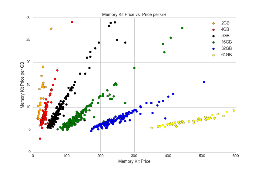
This graph shows the variation in price for the most popular memrory kit sizes, and it also shows the variation in pricing data. The price per GB corresponds to one price (which is usually the lowest listed price) and the price is the average of all vendors' prices.
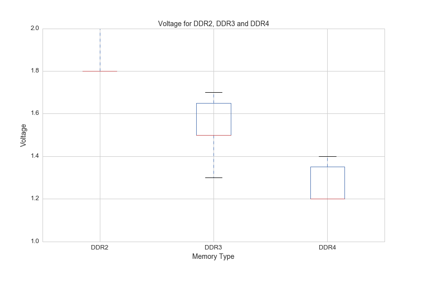
One more thing to note about DDR3 and DDR4 is that DDR4 requires lower voltage:
df3 = df[(df.voltage>0)]
df.boxplot(column='voltage', by='ddr_type', figsize=(12, 8))
plt.suptitle('')
plt.title('Voltage for DDR2, DDR3 and DDR4', fontsize=14)
plt.ylim(1,2)
plt.xlabel('Memory Type', fontsize=14)
plt.ylabel('Voltage', fontsize=14)
plt.xticks(fontsize=13)
plt.yticks(fontsize=13)
plt.savefig(os.path.expanduser('~/Documents/GitHub/briancaffey.github.io/img/memory/voltage.png'))
Video Card / Graphics Card / GPU
Video cards are often the single biggest expense for high-end PCs. They deliver parallel computing performance that is necessary for modern applications like 4K gaming, virtual reality and deep learning. Like the CPU market, the GPU market is dominated by two major players: NVIDIA and AMD. These companies produce graphical processing units, but there are a number of vendors who sell graphics cards using the core chipsets provided by NVIDIA and AMD (and these two companies also sell their own consumer products).
GPUs are attached to the motherboard by PC expansion slots as well as the rear of the case where their display connections are exposed. One GPU metric is the number of DisplayPort type connections. GPUs that support multi-screen setups have higher performance and therefor higher cost, and in general the more screens it can support the more costly the card will be. Here's a breakdown of prices by the number of DisplayPort connections:
df['DisplayPort_count'] = df['DisplayPort'].fillna(0)
df[(df.avg>0)].boxplot(column='avg', by='DisplayPort_count', figsize=(12,8))
plt.ylim(0,2000)
plt.suptitle('')
plt.title('GPU Prices by Display Port Connections', fontsize=14)
plt.xlabel('DisplayPort Connections', fontsize=14)
plt.ylabel('Prices', fontsize=14)
plt.xticks(fontsize=13)
plt.yticks(fontsize=13)
plt.savefig(os.path.expanduser('~/Documents/GitHub/briancaffey.github.io/img/gpu/prices_by_display.png'))

GPUs also sometimes the largest components, here's a histogram for the height of all GPUs:
plt.figure(figsize=(12,8))
df[df.gpu_length>0].gpu_length.hist(bins=25)
plt.title('GPU Length', fontsize=14)
plt.xlabel('Length (inches)', fontsize=14)
plt.ylabel('Count', fontsize=14)
plt.xticks(fontsize=13)
plt.yticks(fontsize=13)
plt.savefig(os.path.expanduser('~/Documents/GitHub/briancaffey.github.io/img/gpu/length_hist.png'))
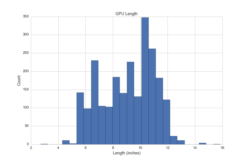
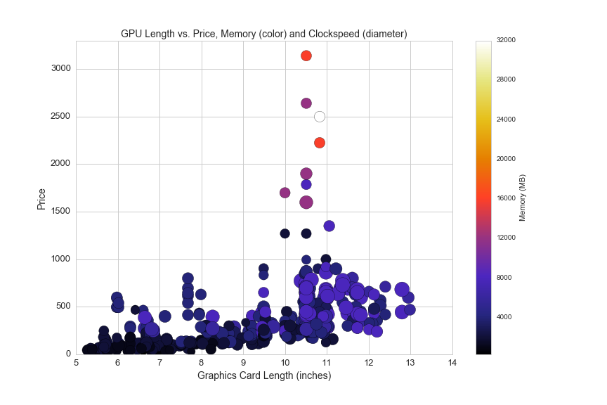
Length is an interesting feature, because you can pack more GPUs into a graphics card that is larger, and you can also have more fans and cooling equipment on larger cards. Here's a look at the relationship between video card length, price, memory and clock speed:
plt.figure(figsize=(12,8))
df_len = df[(df.avg>0)&(df.gpu_length>0)]
plt.scatter(df_len.gpu_length, df_len.avg, c=df_len.memory_mb, cmap='CMRmap', s=df_len.clock_speed_in_mhz/4)
plt.colorbar(label='Memory (MB)')
plt.axis([5,14,0,3300])
plt.title('GPU Length vs. Price, Memory (color) and Clockspeed (diameter)', fontsize=14)
plt.xlabel('Graphics Card Length (inches)', fontsize=14)
plt.ylabel('Price', fontsize=14)
plt.xticks(fontsize=13)
plt.yticks(fontsize=13)
plt.savefig(os.path.expanduser('~/Documents/GitHub/briancaffey.github.io/img/gpu/length_vs_price.png'))
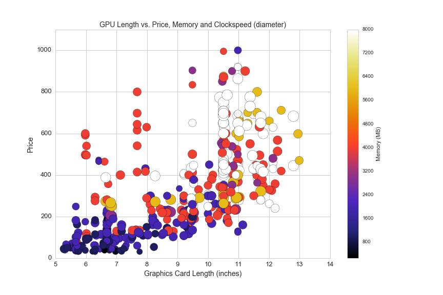
And here is another look at the same data, filtered for graphics cards under $1,100:
plt.figure(figsize=(12,8))
df_len = df[(df.avg>0)&(df.gpu_length>0)&(df.memory_mb<12000)]
plt.scatter(df_len.gpu_length, df_len.avg, c=df_len.memory_mb, cmap='CMRmap', s=df_len.clock_speed_in_mhz/4)
plt.colorbar(label='Memory (MB)')
plt.axis([5,14,0,1100])
plt.title('GPU Length vs. Price, Memory and Clockspeed (diameter)', fontsize=14)
plt.xlabel('Graphics Card Length (inches)', fontsize=14)
plt.ylabel('Price', fontsize=14)
plt.xticks(fontsize=13)
plt.yticks(fontsize=13)
plt.savefig(os.path.expanduser('~/Documents/GitHub/briancaffey.github.io/img/gpu/length_vs_price_2.png'))
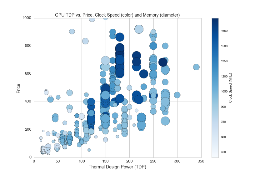
GPUs are also measured in thermal design power (TDP) that we previously examined in CPUs. This scatterplot shows the relationship between TDP, Price, clockspeed and memory:
df1 = df[(df.avg>0)&(df.clock_speed_in_mhz>0)]
plt.figure(figsize=(12,8))
plt.scatter(df1.tdp, df1.avg, c=df1.clock_speed_in_mhz, s=df1.memory_mb/10, cmap='Blues')
plt.colorbar(label='Clock Speed (MHz)')
plt.axis([0,350,0,1000])
plt.title('GPU TDP vs. Price, Clock Speed (color) and Memory (diameter)', fontsize=14)
plt.xlabel('Thermal Design Power (TDP)', fontsize=14)
plt.ylabel('Price', fontsize=14)
plt.xticks(fontsize=13)
plt.yticks(fontsize=13)
plt.savefig(os.path.expanduser('~/Documents/GitHub/briancaffey.github.io/img/gpu/tdp_vs_price.png'))
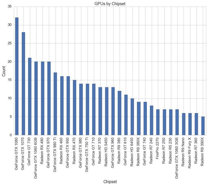
Here is a look at the top 20 most common GPU chipsets for graphics cards:
df1 = df[(df.avg>0)]
plt.figure(figsize=(12,8))
df1.groupby('Chipset').avg.count().sort_values( ascending=False)[:30].plot(kind='bar')
plt.title('GPUs by Chipset', fontsize=14)
plt.xlabel('Chipset', fontsize=14)
plt.ylabel('Count', fontsize=14)
plt.xticks(fontsize=13)
plt.yticks(fontsize=13)
plt.savefig(os.path.expanduser('~/Documents/GitHub/briancaffey.github.io/img/gpu/gpu_chipsets.png'))
And here is the same graph with average prices for the top 20 most common GPU chipsets:
df[df.avg>0].groupby('Chipset').avg.agg(['mean', 'count']).sort_values('count', ascending=False)[:20].plot(kind='bar', figsize=(12,8))
plt.title('Average Price of GPU Chipsets (sorted by count)', fontsize=14)
plt.legend(loc='upper right', fontsize=14)
plt.xlabel('GPU Chipset', fontsize=14)
plt.xticks(fontsize=13)
plt.yticks(fontsize=13)
plt.savefig(os.path.expanduser('~/Documents/GitHub/briancaffey.github.io/img/gpu/gpu_chipsets_by_price.png'))
In the next graph we can see clusters of GPU chipset families by plotting the clock speed and prices of video cards:
df2 = df[(df.avg>0)&(df.clock_speed_in_mhz>0)&(df.memory_mb<10000)]
plt.figure(figsize=(12,8))
plt.scatter(df2.clock_speed_in_mhz, df2.avg, s=75, c=df2.memory_mb, cmap='CMRmap_r')
plt.colorbar(label='Memory (MB)')
plt.axis([500,1800,0,1000])
plt.title('Clock Speed (MHz) vs. Price and Memory (color)', fontsize=14)
plt.xlabel('Clock Speed', fontsize=14)
plt.ylabel('Price', fontsize=14)
plt.xticks(fontsize=13)
plt.yticks(fontsize=13)
plt.savefig(os.path.expanduser('~/Documents/GitHub/briancaffey.github.io/img/gpu/clock_speed_vs_price_and_memory.png'))
Now let's look at six generations of NVIDIA GPUs by clock speed:
#6 generations of NVIDIA graphics cards
df_N = df[(df.make=="NVIDIA")&(df.avg>0)]
df_N['NVIDIA_Series'] = [10 if 'GTX 10' in x else \
                          9 if 'GTX 9' in x else \
                          7 if 'GTX 7' in x else \
                          6 if 'GTX 6' in x else \
                          5 if 'GTX 5' in x else \
                          4 if 'GTX 4' in x else \
                          'other' for x in df_N.Chipset]

plt.figure(figsize=(15,10))
plt.axis([500,1800,0,1000])
plt.title('6 Generations of NVIDIA Graphics Cards: Price vs. Clock Speed', fontsize=14)
plt.xlabel('Clock Speed MHz', fontsize=14)
plt.ylabel('Price', fontsize=14)

colors = ['#76b900', '#8946ff', '#cea503', '#9c0000', '#5c5c5c', '#0b75bd']
s = 150
n10 = plt.scatter(df_N[df_N.NVIDIA_Series==10].clock_speed_in_mhz, df_N[df_N.NVIDIA_Series==10].avg, color = colors[0], s=s)
n9 = plt.scatter(df_N[df_N.NVIDIA_Series==9].clock_speed_in_mhz, df_N[df_N.NVIDIA_Series==9].avg, color = colors[1], s=s)
n7 = plt.scatter(df_N[df_N.NVIDIA_Series==7].clock_speed_in_mhz, df_N[df_N.NVIDIA_Series==7].avg, color = colors[2], s=s)
n6 = plt.scatter(df_N[df_N.NVIDIA_Series==6].clock_speed_in_mhz, df_N[df_N.NVIDIA_Series==6].avg, color = colors[3], s=s)
n5 = plt.scatter(df_N[df_N.NVIDIA_Series==5].clock_speed_in_mhz, df_N[df_N.NVIDIA_Series==5].avg, color = colors[4], s=s)
n4 = plt.scatter(df_N[df_N.NVIDIA_Series==4].clock_speed_in_mhz, df_N[df_N.NVIDIA_Series==4].avg, color = colors[5], s=s)

plt.legend((n10, n9, n7, n6, n5, n4),
           ('10 Series', '9 Series', '7 Series', '6 Series', '5 Series', '4 Series'),
           title = 'NVIDIA GeForce Generations',
           scatterpoints=3,
           loc='upper left',
           ncol=2,
           fontsize=14)
sns.despine()
plt.show()

plt.savefig(os.path.expanduser('~/Documents/GitHub/briancaffey.github.io/img/gpu/six_NVIDIA.png'))
It's also helpful to compare the most recent two series of NVIDIA GPUs by chipset families:
#10 Series vs. 9 Series
df_N = df[(df.make=="NVIDIA")&(df.avg>0)]
df_N['NVIDIA_Series_9_10'] = [1080 if 'GTX 108' in x else \
                          1070 if 'GTX 1070' in x else \
                          1060 if 'GTX 1060' in x else \
                          980 if 'GTX 980' in x else \
                          970 if 'GTX 970' in x else \
                          960 if 'GTX 960' in x else \
                          950 if 'GTX 950' in x else \
                          'other' for x in df_N.Chipset]

plt.figure(figsize=(15,10))
plt.axis([800,1800,0,1000])
plt.title('NVIDIA GeForce GTX: 10 Series vs. 9 Series', fontsize=14)
plt.xlabel('Clock Speed (MHz)', fontsize=14)
plt.ylabel('Price', fontsize=14)

colors = ['#76b900', '#8946ff', '#5c5c5c', '#9c0000', '#cea503', '#0b75bd', 'red']
s = 150

n1080 = df_N[df_N.NVIDIA_Series_9_10==1080]
n1070 = df_N[df_N.NVIDIA_Series_9_10==1070]
n1060 = df_N[df_N.NVIDIA_Series_9_10==1060]
n980 = df_N[df_N.NVIDIA_Series_9_10==980]
n970 = df_N[df_N.NVIDIA_Series_9_10==970]
n960 = df_N[df_N.NVIDIA_Series_9_10==960]
n950 = df_N[df_N.NVIDIA_Series_9_10==950]

n_1080 = plt.scatter(n1080.clock_speed_in_mhz, n1080.avg, color = colors[0], s=s)
n_1070 = plt.scatter(n1070.clock_speed_in_mhz, n1070.avg, color = colors[1], s=s)
n_1060 = plt.scatter(n1060.clock_speed_in_mhz, n1060.avg, color = colors[2], s=s)
n_980 = plt.scatter(n980.clock_speed_in_mhz, n980.avg, color = colors[3], s=s)
n_970 = plt.scatter(n970.clock_speed_in_mhz, n970.avg, color = colors[4], s=s)
n_960 = plt.scatter(n960.clock_speed_in_mhz, n960.avg, color = colors[5], s=s)
n_950 = plt.scatter(n950.clock_speed_in_mhz, n950.avg, color = colors[6], s=s)

plt.legend((n_1080, n_1070, n_1060, n_980, n_970, n_960, n_950),
           ('1080', '1070', '1060', '980', '970', '960', '950'),
           title = 'NVIDIA GeForce',
           scatterpoints=3,
           loc='upper left',
           ncol=1,
           fontsize=14)
plt.xticks(fontsize=13)
plt.yticks(fontsize=13)
sns.despine()
plt.show()
plt.savefig(os.path.expanduser('~/Documents/GitHub/briancaffey.github.io/img/gpu/9_vs_10.png'))
Finally, as we did for CPUs, we can look at the core memory clock and the boost clock for GPUs:
df2 = df[(df.avg>0)&(df.clock_speed_in_mhz>0)&(df.boost_clock_speed_mhz>0)&(df.tdp>0)]

from sklearn.linear_model import LinearRegression
lreg = LinearRegression()

x = df2.clock_speed_in_mhz
Y = df2.boost_clock_speed_mhz

x = x.values.reshape(-1,1)
Y = Y.values.reshape(-1,1)

lreg.fit(x, Y, sample_weight=None)
s = df2.tdp*3
a = 0.3
sns.set_style('whitegrid')
plt.figure(figsize=(12,8))
plt.plot(x,lreg.predict(x), c='y')
plt.scatter(df2[df.make=='NVIDIA'].clock_speed_in_mhz, df2[df.make=='NVIDIA'].boost_clock_speed_mhz, s=s, c='green', alpha=a)
plt.scatter(df2[df.make=='AMD'].clock_speed_in_mhz, df2[df.make=='AMD'].boost_clock_speed_mhz, s=s, c='r', alpha=a)
plt.title('Core Clock vs. Boost Clock and TDP (diameter)', fontsize=14)
plt.xlabel('Core Clock Speed (MHz)', fontsize=14)
plt.ylabel('Boost Clock Speed (MHz)', fontsize=14)
plt.xticks(fontsize=13)
plt.yticks(fontsize=13)
plt.axis([600,2100,600,2100])
x_points = [700,1000,1500,2000]
y_points = [700,1000,1500,2000]

plt.plot(x_points,y_points, c='blue')
plt.legend([ 'Line of best fit', 'y = x', 'Core vs. Boost Clock (NVIDIA)', 'Core vs. Boost Clock (AMD)'], loc='upper left', fontsize=13)
plt.savefig(os.path.expanduser('~/Documents/GitHub/briancaffey.github.io/img/gpu/gpu_clock_vs_boost.png'))
The latest generation of GPUs at much higher clock speeds than previous generations are able to boost clocks even faster than previous generations, on average. This is shown by the slightly steeper curve of the line of best fit as compared with y = x.
Hard Drives
Hard drive sizes have been growing at an exponential rate since the 1950s. This chart from Wikipedia shows the growth of storage sizes on a logarithmic scale in recent decades:
Linear growth on a logarithmic scale corresponds to exponential growth on a linear scale, which is the basis of Moore's Law. Hard drive disks follow a growth pattern similar to Moore's Law called Kryder's Law. Here is a scatter plot of storage drive sizes and prices:
sns.set_style('whitegrid')
plt.figure(figsize=(12,8))
plt.axis([0,10500,0,1500])
ssd = df[(df.avg>0)&(df.is_ssd=="Yes")]
hdd = df[(df.avg>0)&(df.is_ssd=="No")]
plt.title('Hard Drive Sizes (GB) vs. Prices ', fontsize=14)
s=75
plt.scatter(ssd.storage_gb, ssd.avg, c='black', s=s, alpha=.3)
plt.scatter(hdd.storage_gb, hdd.avg, c='red', s=s, alpha=.3)
plt.legend(['SSD', 'HDD'], loc='upper right', fontsize=14)
plt.xlabel('Hard Drive size (GB)', fontsize=14)
plt.ylabel('Price', fontsize=14)
plt.xticks(fontsize=13)
plt.yticks(fontsize=13)
plt.savefig(os.path.expanduser('~/Documents/GitHub/briancaffey.github.io/img/storage/storage_vs_price.png'))
HDD refers to a spinning hard drive disk. Electromechanical magnetic disks spin at high freuencies and a physical arm reads and writes data to and from the spinning disks. SSDs, or Solid state drives, have a number of advantages over spinning drives. SSDs have no moving parts, which makes them more shock resistant and quiter than HDDs. SSDs also have lower access time and lower latency, but they come at a much higher price per GB of storage than HDDs.
The next two graphs show SSDs and HDDs, respectively.
plt.figure(figsize=(12,8))
plt.axis([0,2000,0,1500])
ssd = df[(df.avg>0)&(df.is_ssd=="Yes")]

plt.scatter(ssd.storage_gb, ssd.avg, s=75, alpha=.2)
plt.title('SSD Size vs. Price', fontsize=14)
plt.xlabel('SSD Hard Drive size (GB)', fontsize=14)
plt.ylabel('Price', fontsize=14)
plt.xticks(fontsize=13)
plt.yticks(fontsize=13)
plt.savefig(os.path.expanduser('~/Documents/GitHub/briancaffey.github.io/img/storage/ssd_storage_vs_price.png'))
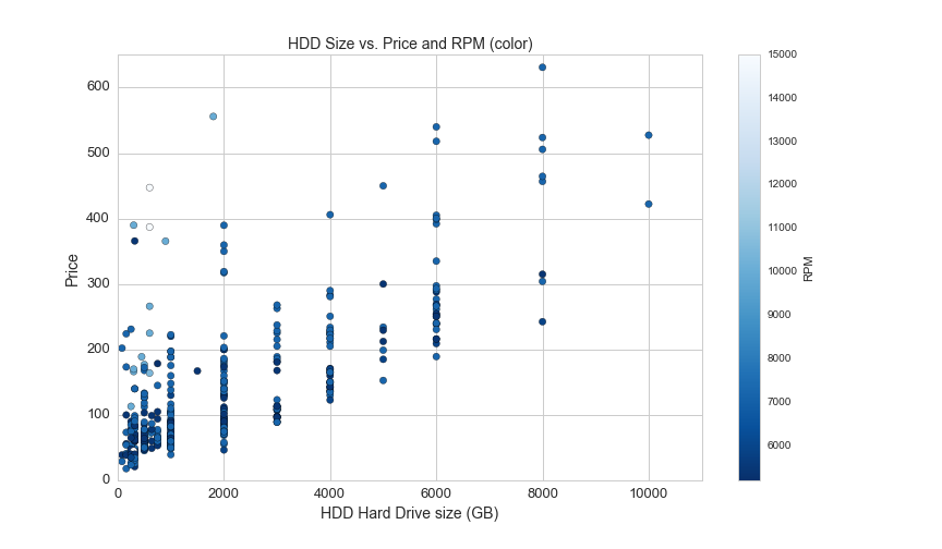
For HDDs, the color of each point represent the speed in rotations per minute of the spinning disk:
plt.figure(figsize=(12,7))
plt.axis([0,11000,0,650])
hdd = df[(df.avg>0)&(df.is_ssd=="No")&(df.RPM.notnull())]
plt.scatter(hdd.storage_gb, hdd.avg, c=hdd.RPM, s=40, cmap="Blues_r")
plt.colorbar(label='RPM')
plt.title('HDD Size vs. Price and RPM (color)', fontsize=14)
plt.xlabel('HDD Hard Drive size (GB)', fontsize=14)
plt.ylabel('Price', fontsize=14)
plt.xticks(fontsize=13)
plt.yticks(fontsize=13)
plt.savefig(os.path.expanduser('~/Documents/GitHub/briancaffey.github.io/img/storage/hdd_storage_vs_price.png'))
This graph shows the price and the price per GB for SSDs and HDDs:
plt.figure(figsize=(12,8))
plt.axis([0,5100,0,3])
a=.3
plt.scatter(ssd.storage_gb,ssd.ppgb, s= 50, alpha=a, color='black')
plt.scatter(hdd.storage_gb,hdd.ppgb, s= 50, alpha=a, color='red')
plt.title('Price per GB of Hard Drive vs. Storage Capacity', fontsize=14)
plt.xlabel('Storage Capacity (GB)', fontsize=14)
plt.ylabel('Price per GB', fontsize=14)
plt.xticks(fontsize=13)
plt.yticks(fontsize=13)
plt.legend(['SSD', 'HDD'], loc='upper right', fontsize=14)
plt.savefig(os.path.expanduser('~/Documents/GitHub/briancaffey.github.io/img/storage/storage_vs_ppgb.png'))
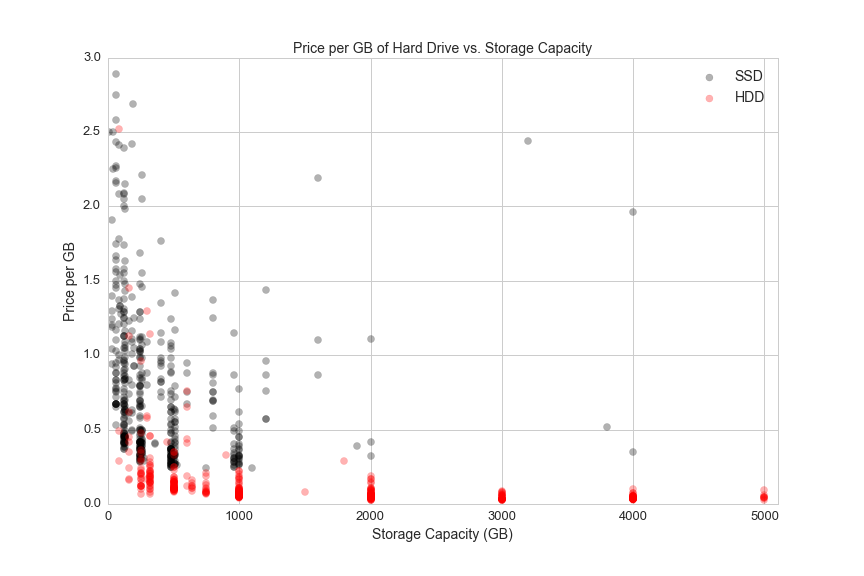
Both HDDs and SSDs become less expensive per GB as they scale.
Case Fans
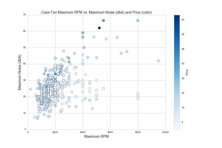
Case fans are an important consideration for enthusiast-level PC buidlers. Case fan features include maximum RPM, maximum sound (dbA, or A-weighted decibels), maximum airflow (measured in cubic feet per minute, or CFM), fan size (mm) and static pressure (mm/H2O, a measure of pressure). These fan features are determined by the power of the fan motor and the shape, angle and spacing of the fan blades. Here are some of these features on scatter plots:
df1 = df[(df.noise>0)&(df.max_flow>0)&(df.rpm_max>0)&(df.avg>0)&(df.avg<75)]
plt.figure(figsize=(12,8))
plt.scatter(df1.rpm_max, df1.noise, c=df1.avg, cmap='Blues', s=100)
plt.colorbar(label='Price')
plt.axis([0,10000,0,70])
plt.xlabel('Maximum RPM', fontsize=14)
plt.ylabel('Maximum Noise (dbA)', fontsize=14)
plt.title('Case Fan Maximum RPM vs. Maximum Noise (dbA) and Price (color)', fontsize=14)
plt.savefig(os.path.expanduser('~/Documents/GitHub/briancaffey.github.io/img/fan/rpm_vs_noise.png'))
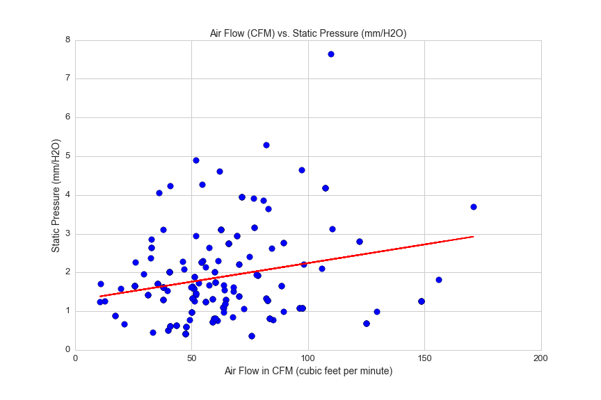
260 of 1192 case fans in this dataset include a rating for static pressure. Static pressure can be thought of as the force by which air is pushed out of the fan. If you put your hand in front of a fan with low static pressure, you will feel a gentle flow of air. Fans with high static pressure have stronger airflow, but not necessarily more airflow, as measured in CFM.
This graph shows air flow plotted against static pressure, and the weak correlation between the two variables:
df5 = df[(df.avg>0)&(df.max_flow>0)&(df.static_pressure>0)&(df.rpm_max>0)&(df.static_pressure<15)]

from sklearn.linear_model import LinearRegression
lreg = LinearRegression()

X = df5.max_flow.reshape(df5.max_flow.shape[0],1)
y = df5.static_pressure.reshape(df5.static_pressure.shape[0],1)
lreg.fit(X, y, sample_weight=None)

plt.figure(figsize=(12,8))
plt.scatter(df5.max_flow, df5.static_pressure, s=75)
plt.title('Air Flow (CFM) vs. Static Pressure (mm/H2O)', fontsize=14)
plt.xlabel('Air Flow in CFM (cubic feet per minute)', fontsize=14)
plt.ylabel('Static Pressure (mm/H2O)', fontsize=14)
plt.xticks(fontsize=13)
plt.yticks(fontsize=13)
plt.axis([0,200,0,8])

#plot regression line
flow = df5.max_flow.reshape(df5.max_flow.shape[0],1)
pred = lreg.predict(df5.max_flow.reshape(df5.max_flow.shape[0],1))
plt.plot(flow ,pred, color='red')
plt.savefig(os.path.expanduser('~/Documents/GitHub/briancaffey.github.io/img/fan/air_flow_v_static_pressure.png'))

print lreg.score(X, y, sample_weight=None)
0.0345903950712
Two fan features with a strong correlation are maximum RPM and static pressure:
df5 = df[(df.avg>0)&(df.max_flow>0)&(df.static_pressure>0)&(df.rpm_max>0)&(df.static_pressure<15)]

from sklearn.linear_model import LinearRegression
lreg = LinearRegression()
X = df5.rpm_max.reshape(df5.rpm_max.shape[0],1)
y = df5.static_pressure.reshape(df5.static_pressure.shape[0],1)
lreg.fit(X, y, sample_weight=None)

plt.figure(figsize=(12,8))
plt.scatter(df5.rpm_max, df5.static_pressure, s=75)

plt.axis([0,8000,0,16])
plt.title('Maximum RPM vs. Static Pressure (mm/H2O)', fontsize=14)
plt.xlabel('Maximum RPM', fontsize=14)
plt.ylabel('Static Pressure (mm/H2O)', fontsize=14)
plt.xticks(fontsize=13)
plt.yticks(fontsize=13)

#plot regression line
size = df5.rpm_max.reshape(df5.rpm_max.shape[0],1)
pred = lreg.predict(df5.rpm_max.reshape(df5.rpm_max.shape[0],1))
plt.plot(size ,pred, color='red')
plt.savefig(os.path.expanduser('~/Documents/GitHub/briancaffey.github.io/img/fan/rpm_max_vs_static_pressure.png'))
print lreg.score(X,y,sample_weight=None)
0.711316685518
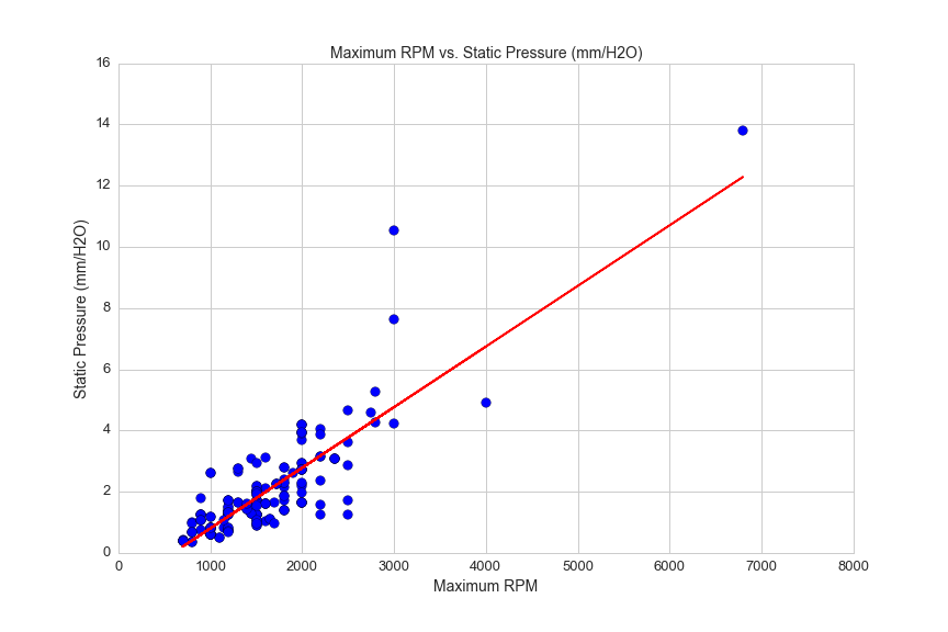
The stronger force of the air flow from high static pressure fans is better at blowing hot air off of hot surfaces, so these fans are often attached to liquid CPU cooler radiators and CPU cooler heat blocks.
As we discussed TDP and CPU coolers, we know that managing heat well will improve performance. Every part of a PC generates heat. Some memory sticks even include heat shrouds to help keep temperatures down. Software utilities are available to monitor the temperature of every component in a PC build, and dynamically change the fan speeds to help keep temperatures low and framerates high.
Monitors
Monitors come in all shapes and sizes. Here's a look at the different dimensions of monitors listed:
plt.figure(figsize=(12,8))
plt.scatter(df.screen_x, df.screen_y, alpha=0.01, s=150)
plt.gca().set_aspect('equal', adjustable='box')
plt.axis([0,35,0,35./2])
plt.title('Screen Size')
plt.xlabel('Screen Width (inches)', fontsize=14)
plt.ylabel('Screen Height (inches)', fontsize=14)
plt.xticks(fontsize=13)
plt.yticks(fontsize=13)
plt.savefig(os.path.expanduser('~/Documents/GitHub/briancaffey.github.io/img/monitor/screen_size.png'))
Monitors are measured not only in size, but in a number of different measures related to time. Framerate refers to how many frames per second are rendered in programs, typically games. A display monitor can show as many frames per second as its refresh rate allows. Most modern games and monitors use a technology called V-Sync (vertical-sync), which limits the frame rate to the maximum refresh rate that the monitor can handle.
Input lag and response time are two other important monitor metrics, particullarly for competitive gamers. Input lag refers to the amount of time it takes for user input from peripherals, such as mouse and keyboard, to be reflected on the screen. Input lag typically ranges from (range), and can make all of the difference in FPS games (first-person shooters). Here's an explination of response time from an enthusiast monitor site, www.144hzmonitors.com:
Response time is a measure of quickly a pixel can display a change from either black to white or from one shade of gray to another. Lower response times are better. Normal response time right now is 1ms for TN panels and 4ms for IPS panels.
Response time is an important metric for playing fast-paced games and watching action movies. If pixels are not able to fully change color in between the time of each from (typically 17 ms for 60Hz monitors), then images displayed may appear with blurred motion trailing certain objects displayed on screen.
There are lots of features for monitors that would seem to be good predictors of price, but there is too much missing data to draw meaningful conclusions. Instead, we can look at another dimension of the pricing that we still haven't explored.
Vendor Data
In the graphs and models used above for exploring various types of PC components, the price associated with an individual part is the average of prices offered by any number of vendors. For example, one CPU may be sold by Amazon for $150.00, NewEgg for $145.00 and NCIX US for $170.00. This CPU would be priced at $155 in the dataset.
I'm very interested in understanding how the different vendors compare to one another on product offering prices. My intuition and (experience using the site) tells me that Amazon has the best deals overall, but I would like to find a way to show this, and possibly rank and score the vendors against one another.
Here's a simple method I've devised for comparing vendors:
df['Pricing_'] = [ast.literal_eval(x) for x in df.Pricing]

def score_vendors(prices):
    mean = np.mean([prices[x] for x in prices])
    std = np.std([prices[x] for x in prices])
    def z_score(std, mean, price):
        diff = float(price - mean)
        z_score = diff/std
        return z_score
    vendor_dict = {}
    for x in prices:
        vendor_z_score = z_score(std, mean, prices[x])
        vendor_dict[x] = vendor_z_score
    return vendor_dict

vendor_z_score_list = []
for x in df.Pricing_:
    z_score_dict = score_vendors(x)
    vendor_z_score_list.append(z_score_dict)

vend_df = pd.DataFrame(vendor_z_score_list)

vendor_avg = {}
for x in vend_df.columns:
    vendor_avg[x] = vend_df[x].dropna().sum()/vend_df[x].dropna().count()

vendor_avg_chart = pd.DataFrame(vendor_avg, index=[0])

vendor_avg_chart.T.sort_values(by=0, ascending=True).plot(kind='bar', figsize=(12,8))
plt.title('Average Z-score for Monitor prices by Vendor', fontsize=14)
plt.ylabel('Count', fontsize=14)
plt.xlabel('Vendor', fontsize=14)
plt.xticks(fontsize=13)
plt.yticks(fontsize=13)
plt.legend(['Average Z-score'], loc='upper left', fontsize=14)
One problem with this method of scoring is that there is a very small number of price observations for each part, and the price observations generally are not normally distributed. Also, some vendors offer significantly more products than others. However, it does support my guess that Amazon has the most competitive product offerings overall.
The products with the fewest offerings tend to have the highest prices. Here's a look at how many monitors each vendor offers:
vendor_count = {}
for x in vend_df.columns:
    vendor_count[x] = vend_df[x].dropna().count()

vendor_count_chart = pd.DataFrame(vendor_count, index=[0])

vendor_count_chart.T.sort_values(by=0, ascending=True).plot(kind='bar', figsize=(12,8))
plt.title('Product count by Vendor', fontsize=14)
plt.ylabel('Count', fontsize=14)
plt.xlabel('Vendor', fontsize=14)
plt.xticks(fontsize=13)
plt.yticks(fontsize=13)
plt.legend(['Count'], fontsize=14, loc='upper left')
User Reviews
One other interesting dimension of the PC part data is user reviews. Users are able to leave reviews for parts they included in their PCs. Reviews include a short text description with a star-rating (between 1 and 5 stars). Here's a short sample of some of this data:
df.Stars.value_counts().plot(kind='bar', figsize=(12,8), rot=0)
plt.title('GPU User Review Star Ratings', fontsize=14)
plt.xlabel('Star Rating', fontsize=14)
plt.ylabel('Count', fontsize=14)
plt.xticks(fontsize=13)
plt.yticks(fontsize=13)
plt.savefig(os.path.expanduser('~/Documents/GitHub/briancaffey.github.io/img/gpu/star_ratings.png'))
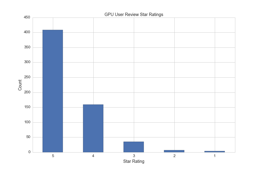
Here's one text rating from each of the 5 categories:
5 Star Rating
Amazing GPU; 4 GB VRAM, and it processes data faster than I thought it would. Not a fancy 900-series one but still very powerful.
4 Star Rating
Runs cool, aesthetically pleasing. -1 star for the VRAM fiasco with Nvidia.
3 Star Rating
I like the aesthetics of this card, but I don’t like that I couldn’t get a 960 like I hoped. I for sure will let people not to go to the store to get a GPU, as they are overpriced at both Best Buy and Micro Center. Also, if you are planning to use this with an analog monitor, be sure that the monitor has a DisplayPort/HDMI/DVI input (and you have a cable of one of those types), as this card DOES NOT in ANY WAY accept analog signals.
2 Star Rating
It's a potato. You cannot play any game at any decent framerates even with a FX-8320.
1 Star Rating
CRAP
With this labeled text data we can use natural language processing (NLP) techniques to predict the sentiment (the star rating in this case) for a new text review. At a very basic level, this works by assigning a probabilities to each word in a review and then generating a binary prediction based on a statistical model.
To simplify the problem, we can have our model predict not how many stars a text review would have, but whether or not the text rating is a 5-star rating. This reduces the complexity of the task.
Before we do any statistical modeling, it is important that we make a very simple prediction based on the most common star rating. For GPUs, 67% of the ratings tend to be 5-star ratings, then we could expect to have an accuracy of 67% percent if we predicted that any new ratings are 5-stars, regardless of the accompanying text. It will be important to check our NLP model against this "baseline" prediction; hopefully we can significantly improve on it.
Naive Bayes text classification
I will be using techniques introduced in the 'Working With Text Data' tutorial introduced in the scikit-learn documentation to classify text reviews. First we will put the labeled review data from the different part types into one DataFrame and map the 5-star rating to a binary variable where 5 stars ratings are mapped to 1 and ratings less than 5 stars are mapped to 0.
os.chdir(os.path.expanduser('~/Documents/Projects/Data/PCPP/parts/x_comment_csv_files/'))
files = os.listdir(os.getcwd())
df = pd.DataFrame(index=[0])
for x in files:
    df1 = pd.read_csv(x)
    df= df.append(df1)

    df = df.dropna()

df['five'] = ['five' if x == 5 else 'not' for x in df.Stars]
df['label'] = df.five.map({'not':0, 'five':1})
print df.label.value_counts()
1    1197
0     769
Name: label, dtype: int64
With 1197 positive reviews and 769 negative reviews, our baseline prediction would would predict that all ratings are postive and we would expect an accuracy of about 60.8% (1197/(1197+769))
The next step is to split the data into training and testing data, tokenize the text data and transform the structure of the data into a format that we can use to train our model. I'll describe this process in detail in another post, but here is how we do this with scikit-learn:
X = df.Comments
y = df.label

from sklearn.cross_validation import train_test_split
X_train, X_test, y_train, y_test = train_test_split(X, y, stratify=df.label, test_size=0.2, random_state=4)

from sklearn.feature_extraction.text import CountVectorizer
vect = CountVectorizer()

X_train_dtm = vect.fit_transform(X_train)
X_test_dtm = vect.transform(X_test)
Finally, we train and evaluate our model using a Multinomial Naive Bayes model:
# train a Naive Bayes model using X_train_dtm
from sklearn.naive_bayes import MultinomialNB
nb = MultinomialNB()
nb.fit(X_train_dtm, y_train)

# make class predictions for X_test_dtm
y_pred_class = nb.predict(X_test_dtm)


# calculate accuracy of class predictions
from sklearn import metrics
print 'Accuracy score: ' + str(metrics.accuracy_score(y_test, y_pred_class))

# confusion matrix
print "Confusion Matrix: \n" + str(metrics.confusion_matrix(y_test, y_pred_class))
Accuracy score: 0.723350253807
Confusion Matrix:
[[ 84  70]
 [ 39 201]]
Here's a quick overview of what we just did. First, we split the labeled text data into training data and test data. We trained our model on the training data and then used the trained model to predict the label of 20% percent of our data set. One important thing to do in the training process is to split the train and test data into equal proportions of positive and negative reviews. This is accomplished by including stratify=df.label as a parameter for our train_test_split function.
We correctly predicted the label for 285 reviews of the 394 text reviews in our testing data, resulting in an accuracy score of 72.3%, which is a significant improvement over our 60% baseline prediction (predicting that all ratings are 5 star ratings). The confusion matrix adds more dimensions to our accuracy score. Here's what the numbers in the confusion matrix correspond to:
- 84: 84 text reviews were correctly predicted to have less than 5 stars. (true positives)
- 70: 70 text reviews were predicted to have 5 stars but had less than 5 stars. (false negatives)
- 39: 39 text reviews were predicted to have less than 5 stars had 5 stars. (false positives)
- 201: 201 text reviews were correctly predicted to have 5 stars. (true negatives)
Let's take a look at a few of the text reviews for false negatives found in our results (reviews that were predicted to have 5 stars but had less than 5 stars):
Great GPU
So far so good.
I don't play too many graphics-heavy games, so this card is pretty good for me.
And here are a few false positives (reviews predicted to have less than 5 star but rated 5 stars):
I bought it because it was yellow
Works great, speed is as-advertised. It's a bit boring for putting on display in your case, but at least it's not covered in some lame sticker.
RAM is RAM. End of story.
It's easy to see the limitations of such a model, but I think that the accuracy than can be achieved from this Naive Bayes approach is simply amazing given the nuance of natural language. A major limitation is the amount of text data available to train the model, and also the fact that some of the text reviews were not as carefully written as reviews you may see on Amazon.
There is a lot of exciting work being done in the area of sentiment analysis. Google uses similar principles when filtering out spam emails from regular emails in your inbox. A better approach would be to use a Recurrent Neural Network with Long Short Term Memory architure like the famous example of IMDB movie review sentiment analysis on DeepLearning.net. I'm curious to see how an advanced model would perform against a Naive Bayes model with a limited amount of training data.
We will do more text analysis with the user descriptions of PC builds. Instead of classifying builds, we will attempt to cluster them into distinct categories based on the language used in their descriptions.
PC Builds
We can now revisit data from the collection of PC builds. Each row in the builds DataFrame contains several links to the parts that are included in the. To do this, we will be merging the part data frames with the PC builds data frame. Here's a bried description of database-style DataFrame joining/merging from the pandas documentation:
pandas has full-featured, high performance in-memory join operations idiomatically very similar to relational databases like SQL. These methods perform significantly better (in some cases well over an order of magnitude better) than other open source implementations (like base::merge.data.frame in R). The reason for this is careful algorithmic design and internal layout of the data in DataFrame.
This will allow us to add additional information (as new columns) for each of the parts in the builds DataFrame. For example, we can add a column indicating the number of watts for the power supply of each build. Let's start with this simple example. Here's how we would perform this operation in pandas:
#navigate to the builds DataFrame
os.chdir('/Users/andrewcaffey/Documents/Projects/Data/PCPP/builds/')

#read in the builds DataFrame
df = pd.read_csv('master_build_csv.csv', low_memory=False)

#Setup a new DataFrame that contains only unique IDs for the PSU of each build
df1 = df[['Power_Supply_1_link']]

#navigate to the PSU DataFrame
os.chdir(os.path.expanduser('~/Documents/Projects/Data/PCPP/parts/x_csv_files/'))

#read in psu DataFrame
psu_df = pd.read_csv('psu_csv.csv')

#Filter for certain columns we are interested in
psu_columns = [u'Modular', u'Name', u'avg', u'short_link', u'power', u'eff_rank', u'ppw', u'Manufacturer', u'Efficiency Certification']

#redefine the DataFrame to include those columns only
psu_df = psu_df[psu_columns]

#merge DataFrames
df1 = pd.merge(df1, psu_df, how='left',left_on='Power_Supply_1_link', right_on='short_link')
The arguments of pd.merge() define how we merge the information from psu_df onto df1. left_on and right_one define the columns that we will use in the df1 and psu_df DataFrames to match information. how='left' essentially specifies that we want to keep all of the original rows of df1, even if the PSU links for those rows are missing. There is more information and examples on DataFrame merging in the documentation.
df1 is now a DataFrame that displays the PSU data for each unique build in the collection of nearly 26,000 PCs. This allows us to ask questions about the PC build data that we couldn't ask with link data alone, such as: what does the distribution of power ratings look like for PSUs across all PC builds?
In the next post I will merge all of the individual PC part data frames with the PC builds data frame so we can have a more granular look at the collection of computers and their parts.
My Recent PC Builds
As promised, here are the two builds that I put together last summer:
Ascension I
PCPartPicker part list / Price breakdown by merchant
Beastmode II (BM2)
PCPartPicker part list / Price breakdown by merchant